library(dplyr)
Attaching package: 'dplyr'The following objects are masked from 'package:stats':
filter, lagThe following objects are masked from 'package:base':
intersect, setdiff, setequal, unionlibrary(ggplot2)Thu Sep 24, 2026 · noon–2pm PT
This page is under active development. The content might change.
Designed for someone with a basic knowledge of R and RStudio — which Module 1 provides.
Module 1 used a small, tidy teaching file with plain English column names. Today we move to data shaped like a real ABCD release: cryptic variable names, values stored as numeric codes, and a lot of missing cells. The work of the session is getting from that raw file to two figures you could put on a poster:
Along the way we build longer data pipelines — select, rename, recode, join, reshape — and learn how ggplot2 figures are put together layer by layer.
Download the three files from the dataset page — data.RDS, data_dictionary.csv and data_dictionary_levels.csv — into your project’s data/ folder, next to abcd-synthetic.csv from Module 1.
Following along live? The code from the session is in module2-live.R. Every chunk on this page is taken from it, in the same order.
Everything today is built from pieces you met in Module 1:
|> — “and then”: hands the result on the left to the function on the rightselect() keeps columns, filter() keeps rows, mutate() adds or changes columnsgroup_by() + a summary function computes one row per groupcount() tabulatesggplot(aes(...)) + geom_*() — a plot is a mapping plus layers, joined by +If any of those is unfamiliar, Module 1 sections 6, 7 and 9 are the place to catch up.
library(dplyr)
Attaching package: 'dplyr'The following objects are masked from 'package:stats':
filter, lagThe following objects are masked from 'package:base':
intersect, setdiff, setequal, unionlibrary(ggplot2)Only two library() calls, yet the code below also uses functions from readr, stringr and tidyr. It reaches them with package::function() notation instead — readr::read_csv() means “the read_csv() function from the readr package”.
That notation does two things. It uses a function without switching the whole package on, and it makes it obvious to the reader where a function comes from. It is a good habit for packages you only need once or twice in a script. The packages still have to be installed (Module 0 did that); :: just skips the loading.
# - CSV

readr::read_csv("data/abcd-synthetic.csv") |>
  glimpse()
Rows: 580 Columns: 9
── Column specification ────────────────────────────────────────────────────────
Delimiter: ","
chr (4): subject_id, visit, site, sex
dbl (5): age_months, total_problems, cognition_score, screen_time_hrs, sleep...
ℹ Use `spec()` to retrieve the full column specification for this data.
ℹ Specify the column types or set `show_col_types = FALSE` to quiet this message.Rows: 580
Columns: 9
$ subject_id <chr> "sub-0001", "sub-0001", "sub-0001", "sub-0002", "sub-0…
$ visit <chr> "baseline", "year_1", "year_2", "baseline", "year_1", …
$ site <chr> "S01", "S01", "S01", "S02", "S02", "S02", "S05", "S05"…
$ age_months <dbl> 111, 125, 136, 110, 123, 134, 130, 142, 153, 127, 137,…
$ sex <chr> "F", "F", "F", "M", "M", "M", "M", "M", "M", "M", "M",…
$ total_problems <dbl> NA, 16, 20, 37, 30, 30, 18, 21, 20, 31, 16, 9, 36, 35,…
$ cognition_score <dbl> 98, 106, NA, 94, 86, 91, 122, 123, 104, 107, 104, 97, …
$ screen_time_hrs <dbl> 0.7, 3.1, 2.8, 2.2, NA, 6.0, 1.9, NA, 3.7, 2.3, 5.3, 3…
$ sleep_hrs <dbl> 9.8, 8.9, 9.2, 10.1, 9.4, 9.1, 8.8, 10.5, 8.1, 9.0, 9.…This is the Module 1 file, read and glimpsed but not stored — there is no <-, so the result is printed and then thrown away. It is here as a reminder of what a CSV gives you: plain columns of numbers and text.
# - RDS (R Data Set)

data <- readRDS("data/data.RDS") |>
  glimpse()
Rows: 2,295
Columns: 53
$ participant_id <chr> "sub-0001", "sub-0001", "sub-00…
$ session_id <fct> ses-00A, ses-01A, ses-02A, ses-…
$ ab_g_dyn__visit_dtt <dttm> 2019-01-01 15:18:00, 2019-07-0…
$ ab_g_dyn__visit_age <dbl> 10.2, 10.7, 12.4, 12.9, 14.0, 1…
$ ab_g_dyn__visit_type <fct> 1, 1, 3, 2, 1, 1, 1, 1, 1, 3, 1…
$ ab_g_dyn__design_site <fct> 8, 8, 8, 8, 8, 21, 21, 21, 21, …
$ ab_g_dyn__cohort_edu__cgs <fct> 4, 4, 4, 4, 4, 5, 5, 5, 5, 5, 3…
$ ab_g_dyn__cohort_income__hhold__3lvl <fct> 777, 777, 777, 777, 777, 3, 3, …
$ ab_g_dyn__cohort_income__hhold__6lvl <fct> 777, 777, 777, 777, 777, 5, 5, …
$ ab_g_stc__design_id__fam <chr> "fam-0001", "fam-0001", "fam-00…
$ ab_g_stc__cohort_ethn <fct> 2, 2, 2, 2, 2, 2, 2, 2, 2, 2, 1…
$ ab_g_stc__cohort_ethnrace__leg <fct> 13, 13, 13, 13, 13, 2, 2, 2, 2,…
$ ab_g_stc__cohort_race__nih <fct> 8, 8, 8, 8, 8, 2, 2, 2, 2, 2, 2…
$ ab_g_stc__cohort_sex <fct> 2, 2, 2, 2, 2, 2, 2, 2, 2, 2, 2…
$ fc_y_fes__cohes_mean <dbl> NA, NA, NA, NA, 1.000, NA, NA, …
$ fc_y_fes__confl_mean <dbl> 0.111, 0.333, 0.000, 0.111, 0.0…
$ fc_y_nsc__ns_003 <fct> 4, NA, 4, NA, NA, 3, 3, 5, 4, 3…
$ fc_y_pm_mean <dbl> 4.2, 3.6, 4.6, 5.0, 4.4, 3.6, 3…
$ mh_p_cbcl__synd__ext_sum <dbl> 1, 1, 1, 3, 0, 2, 1, 5, 1, 3, 1…
$ mh_p_cbcl__synd__int_sum <dbl> 0, 3, 2, 0, 1, 4, 14, 12, 18, 4…
$ mh_y_bisbas__bas__dr_sum <dbl> 5, NA, 3, NA, 5, 2, NA, 3, NA, …
$ mh_y_bisbas__bas__fs_sum <dbl> 6, NA, 4, NA, 5, 5, NA, 3, NA, …
$ mh_y_bisbas__bas__rr_sum <dbl> 10, NA, 12, NA, 11, 9, NA, 12, …
$ mh_y_bisbas__bis_sum <dbl> 1, NA, 10, NA, 3, 12, NA, 8, NA…
$ mh_y_upps__nurg_sum <dbl> 8, NA, 8, NA, 9, 7, NA, 6, NA, …
$ mh_y_upps__pers_sum <dbl> 8, NA, 7, NA, 9, 8, NA, 6, NA, …
$ mh_y_upps__plan_sum <dbl> 8, NA, 7, NA, 9, 7, NA, 9, NA, …
$ mh_y_upps__purg_sum <dbl> 8, NA, 9, NA, 9, 6, NA, 6, NA, …
$ mh_y_upps__sens_sum <dbl> 9, NA, 9, NA, 12, 7, NA, 6, NA,…
$ mr_y_smri__thk__dsk_mean <dbl> 2.797, NA, 2.690, NA, 2.717, 2.…
$ mr_y_smri__vol__dsk__lh_sum <dbl> 298824, NA, 294234, NA, 298563,…
$ mr_y_smri__vol__dsk__rh_sum <dbl> 294512, NA, 292716, NA, 292889,…
$ mr_y_smri__vol__dsk_sum <dbl> 593336, NA, 586950, NA, 591452,…
$ nc_y_nihtb__comp__cryst__agecorr_score <dbl> 154, NA, 145, NA, NA, 113, NA, …
$ nc_y_nihtb__comp__fluid__agecorr_score <dbl> 134, NA, NA, NA, NA, 99, NA, NA…
$ nc_y_nihtb__comp__tot__agecor_score <dbl> 141, NA, NA, NA, NA, 98, NA, NA…
$ nc_y_nihtb__crdst__agecorr_score <dbl> 129, NA, NA, NA, NA, 85, NA, NA…
$ nc_y_nihtb__flnkr__agecor_score <dbl> 136, NA, 123, NA, 124, NA, NA, …
$ nc_y_nihtb__lswmt__agecor_score <dbl> 139, NA, NA, NA, 127, 100, NA, …
$ nc_y_nihtb__picsq__agecor_score <dbl> 137, NA, 130, NA, 139, 97, NA, …
$ nc_y_nihtb__picvcb__agecor_score <dbl> 144, NA, 140, NA, 142, 102, NA,…
$ nc_y_nihtb__pttcp__agecor_score <dbl> 141, NA, 152, NA, 163, 101, NA,…
$ nc_y_nihtb__readr__agecor_score <dbl> NA, NA, 134, NA, 139, 105, NA, …
$ nt_p_yst__screen__wkdy_sum <dbl> 3.6, 4.0, 5.5, 3.1, 5.4, 3.7, 8…
$ nt_p_yst__screen__wknd_sum <dbl> 5.5, 3.8, 3.5, 5.5, 7.9, 6.1, 8…
$ nt_y_stq__screen__wkdy_sum <dbl> 3.1, 5.0, 6.5, 4.4, 9.1, 4.5, 1…
$ nt_y_stq__screen__wknd_sum <dbl> 6.5, 7.1, 7.8, 9.6, 15.1, 6.2, …
$ ph_y_anthr__height_mean <dbl> 58.1, 60.2, 63.2, NA, 68.0, 57.…
$ ph_y_anthr__weight_mean <dbl> 107.0, 115.5, 146.8, NA, 172.4,…
$ ph_y_anthr__waist_001 <dbl> 30.4, NA, 22.2, NA, 28.9, 26.5,…
$ su_y_itu__alc_001 <fct> NA, 4, 4, NA, 4, NA, 4, 777, 3,…
$ su_y_itu__mj_001 <fct> 4, NA, 4, 4, 4, 4, 4, 4, 4, 4, …
$ su_y_itu__nic_001 <fct> NA, 4, NA, NA, NA, 4, 4, 4, 4, ….RDS is R’s own file format. It stores an R object exactly as it was, so factors stay factors (<fct>) and the visit timestamp stays a date-time (<dttm>). A CSV would flatten both into text or numbers, and you would rebuild them by hand every time.
Why does data end up holding the data, when the last step of the pipe is glimpse()? Because glimpse() prints a preview and then passes its input through unchanged. That makes it safe to drop into the middle of any pipeline to peek at what is flowing through — a trick used throughout this session.
2,295 rows and 53 columns: 500 participants, each with up to five annual visits. What the column names mean, and how to read them, is on the dataset page — keep it open in another tab.
Fifty-three columns is too many to think about. The first step is to cut down to the ones the analysis needs, and give the important ones names a human can type.
sub <- data |>
  select(
    # by position
    1:2,
    # by name, simultaneously rename
    age = ab_g_dyn__visit_age,
    site = ab_g_dyn__design_site,
    income = ab_g_dyn__cohort_income__hhold__3lvl,
    sex = ab_g_stc__cohort_sex,
    ethn = ab_g_stc__cohort_ethn,
    # by pattern
    matches("_anthr_"),
    matches("_screen_"),
    matches("_cbcl_")
  ) |>
  rename(
    height = ph_y_anthr__height_mean,
    weight = ph_y_anthr__weight_mean,
    waist = ph_y_anthr__waist_001
  ) |>
  as_tibble() |>
  glimpse()
Rows: 2,295
Columns: 16
$ participant_id <chr> "sub-0001", "sub-0001", "sub-0001", "sub-00…
$ session_id <fct> ses-00A, ses-01A, ses-02A, ses-03A, ses-04A…
$ age <dbl> 10.2, 10.7, 12.4, 12.9, 14.0, 10.4, 12.1, 1…
$ site <fct> 8, 8, 8, 8, 8, 21, 21, 21, 21, 21, 14, 21, …
$ income <fct> 777, 777, 777, 777, 777, 3, 3, 3, 3, 3, 2, …
$ sex <fct> 2, 2, 2, 2, 2, 2, 2, 2, 2, 2, 2, 2, 2, 2, 2…
$ ethn <fct> 2, 2, 2, 2, 2, 2, 2, 2, 2, 2, 1, 2, 2, 2, 2…
$ height <dbl> 58.1, 60.2, 63.2, NA, 68.0, 57.6, 61.4, 64.…
$ weight <dbl> 107.0, 115.5, 146.8, NA, 172.4, 76.8, 96.6,…
$ waist <dbl> 30.4, NA, 22.2, NA, 28.9, 26.5, 28.4, 35.1,…
$ nt_p_yst__screen__wkdy_sum <dbl> 3.6, 4.0, 5.5, 3.1, 5.4, 3.7, 8.2, 6.3, 4.4…
$ nt_p_yst__screen__wknd_sum <dbl> 5.5, 3.8, 3.5, 5.5, 7.9, 6.1, 8.6, 8.0, 5.4…
$ nt_y_stq__screen__wkdy_sum <dbl> 3.1, 5.0, 6.5, 4.4, 9.1, 4.5, 11.5, 8.7, 8.…
$ nt_y_stq__screen__wknd_sum <dbl> 6.5, 7.1, 7.8, 9.6, 15.1, 6.2, 13.3, 13.6, …
$ mh_p_cbcl__synd__ext_sum <dbl> 1, 1, 1, 3, 0, 2, 1, 5, 1, 3, 1, 1, 0, 0, 4…
$ mh_p_cbcl__synd__int_sum <dbl> 0, 3, 2, 0, 1, 4, 14, 12, 18, 4, 7, 13, 5, …select() can pick columns in three different ways, and this one call uses all three:
1:2 means “columns 1 through 2” — here participant_id and session_id. Quick, but fragile: if the column order ever changes, so does what you get.age = ab_g_dyn__visit_age keeps the column and renames it, new_name = old_name. The same pattern works in rename().matches("_anthr_") keeps every column whose name contains _anthr_ — all three anthropometric measures at once. This is where ABCD’s structured names pay off: one short pattern selects a whole instrument.rename() then does the same new = old renaming without dropping anything. The three anthropometric columns came in via matches(), so they are renamed here rather than inside select().
as_tibble() makes sure the result is a tibble, the tidyverse flavour of a data frame, which prints more compactly and more safely than a plain data.frame.
starts_with(), ends_with(), contains() and where() — the other ways to pick columns — are on the wrangling deep-dive.
A dataset fresh from a release is rarely ready to analyse. Four checks, every time:
1, 2) need their labels (Male, Female) before they are useful in a table or a plot legend.NAs are before you decide what to do about them.The labels for coded variables do not live in the data file. They live in data_dictionary_levels.csv — one row per code, per variable:
levels_dict <- readr::read_csv("data/data_dictionary_levels.csv") |>
  glimpse()
Rows: 84 Columns: 5
── Column specification ────────────────────────────────────────────────────────
Delimiter: ","
chr (2): name, label
dbl (2): value, order_level
lgl (1): label_es
ℹ Use `spec()` to retrieve the full column specification for this data.
ℹ Specify the column types or set `show_col_types = FALSE` to quiet this message.Rows: 84
Columns: 5
$ name <chr> "ab_g_dyn__cohort_edu__cgs", "ab_g_dyn__cohort_edu__cgs", …
$ value <dbl> 1, 2, 3, 4, 5, 1, 2, 3, 999, 777, 1, 2, 3, 4, 5, 6, 999, 7…
$ order_level <dbl> 1, 2, 3, 4, 5, 1, 2, 3, 4, 5, 1, 2, 3, 4, 5, 6, 7, 8, 1, 2…
$ label <chr> "Up to high school (No diploma)", "High school diploma/GED…
$ label_es <lgl> NA, NA, NA, NA, NA, NA, NA, NA, NA, NA, NA, NA, NA, NA, NA…site is stored as a number from 1 to 22. To turn those into site names, pull out just the site rows:
site_levels <- levels_dict |>
  filter(
    name == "ab_g_dyn__design_site"
  ) |>
  select(
    value,
    site_label = label
  )
site_levels is now a small two-column lookup table: value (the code) and site_label (what it means). The select() renames label on the way out, so it cannot clash with anything later.
sub2 <- sub |>
  glimpse() |>
  mutate(
    across(
      where(is.numeric),
      ~ round(.x)
    )
  ) |>
  mutate(
    sex = case_when(
      sex == 1 ~ "Male",
      sex == 2 ~ "Female",
      .default = NA
    ),
    visit = stringr::str_replace(session_id, "ses-", "") |>
      readr::parse_number() |>
      factor(),
    site = as.character(site)
  ) |>
  left_join(
    site_levels |>
      mutate(
        value = as.character(value)
      ),
    join_by(site == value)
  ) |>
  glimpse()
Rows: 2,295
Columns: 16
$ participant_id <chr> "sub-0001", "sub-0001", "sub-0001", "sub-00…
$ session_id <fct> ses-00A, ses-01A, ses-02A, ses-03A, ses-04A…
$ age <dbl> 10.2, 10.7, 12.4, 12.9, 14.0, 10.4, 12.1, 1…
$ site <fct> 8, 8, 8, 8, 8, 21, 21, 21, 21, 21, 14, 21, …
$ income <fct> 777, 777, 777, 777, 777, 3, 3, 3, 3, 3, 2, …
$ sex <fct> 2, 2, 2, 2, 2, 2, 2, 2, 2, 2, 2, 2, 2, 2, 2…
$ ethn <fct> 2, 2, 2, 2, 2, 2, 2, 2, 2, 2, 1, 2, 2, 2, 2…
$ height <dbl> 58.1, 60.2, 63.2, NA, 68.0, 57.6, 61.4, 64.…
$ weight <dbl> 107.0, 115.5, 146.8, NA, 172.4, 76.8, 96.6,…
$ waist <dbl> 30.4, NA, 22.2, NA, 28.9, 26.5, 28.4, 35.1,…
$ nt_p_yst__screen__wkdy_sum <dbl> 3.6, 4.0, 5.5, 3.1, 5.4, 3.7, 8.2, 6.3, 4.4…
$ nt_p_yst__screen__wknd_sum <dbl> 5.5, 3.8, 3.5, 5.5, 7.9, 6.1, 8.6, 8.0, 5.4…
$ nt_y_stq__screen__wkdy_sum <dbl> 3.1, 5.0, 6.5, 4.4, 9.1, 4.5, 11.5, 8.7, 8.…
$ nt_y_stq__screen__wknd_sum <dbl> 6.5, 7.1, 7.8, 9.6, 15.1, 6.2, 13.3, 13.6, …
$ mh_p_cbcl__synd__ext_sum <dbl> 1, 1, 1, 3, 0, 2, 1, 5, 1, 3, 1, 1, 0, 0, 4…
$ mh_p_cbcl__synd__int_sum <dbl> 0, 3, 2, 0, 1, 4, 14, 12, 18, 4, 7, 13, 5, …
Rows: 2,295
Columns: 18
$ participant_id <chr> "sub-0001", "sub-0001", "sub-0001", "sub-00…
$ session_id <fct> ses-00A, ses-01A, ses-02A, ses-03A, ses-04A…
$ age <dbl> 10, 11, 12, 13, 14, 10, 12, 13, 14, 14, 10,…
$ site <chr> "8", "8", "8", "8", "8", "21", "21", "21", …
$ income <fct> 777, 777, 777, 777, 777, 3, 3, 3, 3, 3, 2, …
$ sex <chr> "Female", "Female", "Female", "Female", "Fe…
$ ethn <fct> 2, 2, 2, 2, 2, 2, 2, 2, 2, 2, 1, 2, 2, 2, 2…
$ height <dbl> 58, 60, 63, NA, 68, 58, 61, 65, 67, 68, 60,…
$ weight <dbl> 107, 116, 147, NA, 172, 77, 97, 111, 130, 1…
$ waist <dbl> 30, NA, 22, NA, 29, 26, 28, 35, 26, 40, 37,…
$ nt_p_yst__screen__wkdy_sum <dbl> 4, 4, 6, 3, 5, 4, 8, 6, 4, 4, 4, 3, 2, 4, 4…
$ nt_p_yst__screen__wknd_sum <dbl> 6, 4, 4, 6, 8, 6, 9, 8, 5, 10, 6, 4, 5, 5, …
$ nt_y_stq__screen__wkdy_sum <dbl> 3, 5, 6, 4, 9, 4, 12, 9, 8, 8, 4, 4, 3, 5, …
$ nt_y_stq__screen__wknd_sum <dbl> 6, 7, 8, 10, 15, 6, 13, 14, 11, 14, 8, 6, 5…
$ mh_p_cbcl__synd__ext_sum <dbl> 1, 1, 1, 3, 0, 2, 1, 5, 1, 3, 1, 1, 0, 0, 4…
$ mh_p_cbcl__synd__int_sum <dbl> 0, 3, 2, 0, 1, 4, 14, 12, 18, 4, 7, 13, 5, …
$ visit <fct> 0, 1, 2, 3, 4, 0, 1, 2, 3, 4, 0, 0, 1, 2, 3…
$ site_label <chr> "SRI International", "SRI International", "…A lot happens in one pipeline, so take it a step at a time.
across(where(is.numeric), ~ round(.x)) — “for every column that is numeric, replace it with a rounded version of itself”. across() applies one function to many columns; where(is.numeric) picks which ones; ~ round(.x) is the function, with .x standing for “the current column”. The point is to turn age (10.2, 10.7, …) into whole years, which the plot in Q2 needs.
Be aware that it rounds every numeric column — height, weight, screen time and the CBCL scores too. That is fine for the plots today, but in a real analysis you would usually round only the column you meant to, e.g. mutate(age = round(age)).
case_when() — recodes by condition. Each line is condition ~ value, tried in order; .default = NA catches anything that matched no line. sex is a factor whose levels are "1" and "2", and sex == 1 compares against those levels. The result is plain text, "Male" or "Female".
Building visit — session_id looks like ses-02A. str_replace() removes the ses- prefix, leaving 02A; parse_number() pulls out the number, 2; factor() makes it a category. So visit runs 0 to 4 — baseline to year-4.
site = as.character(site) — converting to text ahead of the join. See the next paragraph.
left_join() — this is new, and it is the most important step here. A join matches rows in two tables by a shared key and glues on the columns from the second table. join_by(site == value) says “match site in our data against value in the lookup”. Left join means every row of our data is kept, whether or not it finds a match.
Joins only match when the keys are the same type. site in the data is a factor; value in the lookup is a number. Converting both to character first — as.character(site) above, as.character(value) inside the join — puts them on common ground.
Other join types, what happens when the key types do not match, and how to label all thirteen coded variables in one go, are on the wrangling deep-dive.
After any join, check it did what you expected:
sub2 |>
  count(site, site_label)
# A tibble: 22 × 3
site site_label n
<chr> <chr> <int>
1 1 Children's Hospital Los Angeles 120
2 10 University of California, San Diego 64
3 11 University of Florida 72
4 12 University of Maryland, Baltimore 10
5 13 University of Michigan 43
6 14 University of Minnesota 207
7 15 University of Pittsburgh Medical Center 88
8 16 University of Utah 111
9 17 University of Vermont 142
10 18 University of Wisconsin, Milwaukee 61
# ℹ 12 more rowsEvery code has a name next to it, and no site_label is NA. If a join silently fails to match, this is where you see it.
The third check on the list — looking for values that cannot be right. summary() on the columns you plan to use is the fastest way:
sub2 |>
  select(height, weight, waist, matches("_screen_")) |>
  summary()
height weight waist nt_p_yst__screen__wkdy_sum
Min. :45.00 Min. : 41.0 Min. :12.00 Min. : 0.000
1st Qu.:57.00 1st Qu.: 87.0 1st Qu.:26.00 1st Qu.: 2.000
Median :61.00 Median :109.0 Median :29.00 Median : 4.000
Mean :60.91 Mean :112.9 Mean :29.84 Mean : 4.213
3rd Qu.:64.00 3rd Qu.:133.0 3rd Qu.:34.00 3rd Qu.: 5.000
Max. :78.00 Max. :268.0 Max. :52.00 Max. :56.000
NA's :378 NA's :378 NA's :491 NA's :41
nt_p_yst__screen__wknd_sum nt_y_stq__screen__wkdy_sum
Min. : 0.000 Min. : 1.000
1st Qu.: 4.000 1st Qu.: 4.000
Median : 5.000 Median : 5.000
Mean : 6.154 Mean : 6.422
3rd Qu.: 7.000 3rd Qu.: 8.000
Max. :77.000 Max. :80.000
NA's :41 NA's :23
nt_y_stq__screen__wknd_sum
Min. : 2.000
1st Qu.: 5.000
Median : 8.000
Mean : 9.498
3rd Qu.: 11.000
Max. :150.000
NA's :18 Read the Min. and Max. rows. A weekend screen-time total of 150 hours is impossible, however much a 13-year-old might want it to be, and a waist circumference of 12 inches is not a plausible child. The medians look sensible. It is a handful of extreme values that do not.
Spotting implausible values is a descriptive job, and it belongs here. Deciding what to do about them — drop them, cap them, or treat them as missing — is an analysis decision with consequences, and it gets proper treatment in Module 3. For now, keep an eye out for them in the plots below: boxplots are very good at showing them.
The first question: how do body measurements change across visits, and do they differ by sex? Start with one measure, waist circumference:
sub2 |>
  glimpse() |>
  # tidyr::drop_na(height) |>
  mutate(
    sex = factor(
      sex,
      levels = c("Male", "Female")
    ),
    visit = stringr::str_replace(session_id, "ses-", "") |>
      readr::parse_number() |>
      factor()
  ) |>
  glimpse() |>
  ggplot(
    aes(
      x = visit,
      # x = session_id,
      y = waist,
      fill = sex,
      col = sex
    )
  ) +
  theme_bw(20) +
  # geom_hline(yintercept = 60, colour = "grey60") +
  # geom_vline(xintercept = 12.5, colour = "red") +
  # geom_point()
  # geom_violin(col = "black") +
  geom_boxplot(col = "black") +
  # geom_jitter(alpha = 0.5, size = 0.2) +
  # scale_fill_viridis_d() +
  scale_fill_manual(values = c("orange", "grey60")) +
  scale_color_viridis_d() +
  coord_flip() +
  theme(
    legend.position = "top"
  )
Rows: 2,295
Columns: 18
$ participant_id <chr> "sub-0001", "sub-0001", "sub-0001", "sub-00…
$ session_id <fct> ses-00A, ses-01A, ses-02A, ses-03A, ses-04A…
$ age <dbl> 10, 11, 12, 13, 14, 10, 12, 13, 14, 14, 10,…
$ site <chr> "8", "8", "8", "8", "8", "21", "21", "21", …
$ income <fct> 777, 777, 777, 777, 777, 3, 3, 3, 3, 3, 2, …
$ sex <chr> "Female", "Female", "Female", "Female", "Fe…
$ ethn <fct> 2, 2, 2, 2, 2, 2, 2, 2, 2, 2, 1, 2, 2, 2, 2…
$ height <dbl> 58, 60, 63, NA, 68, 58, 61, 65, 67, 68, 60,…
$ weight <dbl> 107, 116, 147, NA, 172, 77, 97, 111, 130, 1…
$ waist <dbl> 30, NA, 22, NA, 29, 26, 28, 35, 26, 40, 37,…
$ nt_p_yst__screen__wkdy_sum <dbl> 4, 4, 6, 3, 5, 4, 8, 6, 4, 4, 4, 3, 2, 4, 4…
$ nt_p_yst__screen__wknd_sum <dbl> 6, 4, 4, 6, 8, 6, 9, 8, 5, 10, 6, 4, 5, 5, …
$ nt_y_stq__screen__wkdy_sum <dbl> 3, 5, 6, 4, 9, 4, 12, 9, 8, 8, 4, 4, 3, 5, …
$ nt_y_stq__screen__wknd_sum <dbl> 6, 7, 8, 10, 15, 6, 13, 14, 11, 14, 8, 6, 5…
$ mh_p_cbcl__synd__ext_sum <dbl> 1, 1, 1, 3, 0, 2, 1, 5, 1, 3, 1, 1, 0, 0, 4…
$ mh_p_cbcl__synd__int_sum <dbl> 0, 3, 2, 0, 1, 4, 14, 12, 18, 4, 7, 13, 5, …
$ visit <fct> 0, 1, 2, 3, 4, 0, 1, 2, 3, 4, 0, 0, 1, 2, 3…
$ site_label <chr> "SRI International", "SRI International", "…
Rows: 2,295
Columns: 18
$ participant_id <chr> "sub-0001", "sub-0001", "sub-0001", "sub-00…
$ session_id <fct> ses-00A, ses-01A, ses-02A, ses-03A, ses-04A…
$ age <dbl> 10, 11, 12, 13, 14, 10, 12, 13, 14, 14, 10,…
$ site <chr> "8", "8", "8", "8", "8", "21", "21", "21", …
$ income <fct> 777, 777, 777, 777, 777, 3, 3, 3, 3, 3, 2, …
$ sex <fct> Female, Female, Female, Female, Female, Fem…
$ ethn <fct> 2, 2, 2, 2, 2, 2, 2, 2, 2, 2, 1, 2, 2, 2, 2…
$ height <dbl> 58, 60, 63, NA, 68, 58, 61, 65, 67, 68, 60,…
$ weight <dbl> 107, 116, 147, NA, 172, 77, 97, 111, 130, 1…
$ waist <dbl> 30, NA, 22, NA, 29, 26, 28, 35, 26, 40, 37,…
$ nt_p_yst__screen__wkdy_sum <dbl> 4, 4, 6, 3, 5, 4, 8, 6, 4, 4, 4, 3, 2, 4, 4…
$ nt_p_yst__screen__wknd_sum <dbl> 6, 4, 4, 6, 8, 6, 9, 8, 5, 10, 6, 4, 5, 5, …
$ nt_y_stq__screen__wkdy_sum <dbl> 3, 5, 6, 4, 9, 4, 12, 9, 8, 8, 4, 4, 3, 5, …
$ nt_y_stq__screen__wknd_sum <dbl> 6, 7, 8, 10, 15, 6, 13, 14, 11, 14, 8, 6, 5…
$ mh_p_cbcl__synd__ext_sum <dbl> 1, 1, 1, 3, 0, 2, 1, 5, 1, 3, 1, 1, 0, 0, 4…
$ mh_p_cbcl__synd__int_sum <dbl> 0, 3, 2, 0, 1, 4, 14, 12, 18, 4, 7, 13, 5, …
$ visit <fct> 0, 1, 2, 3, 4, 0, 1, 2, 3, 4, 0, 0, 1, 2, 3…
$ site_label <chr> "SRI International", "SRI International", "…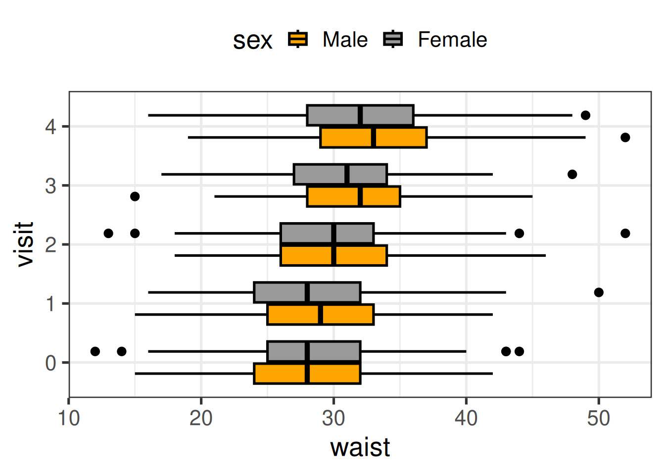
Before the plot, the mutate() does two things:
sex = factor(sex, levels = c("Male", "Female")) fixes the order of the categories. Left alone, R sorts text alphabetically, so Female would come first. The order of the levels is the order of the legend and of the colours.visit = ... rebuilds visit from session_id. sub2 already has an identical visit column from section 3, so this line is redundant — harmless, but you could delete it and get the same plot.Then the plot, one piece at a time:
aes(x = visit, y = waist, fill = sex, col = sex) — visit on one axis, waist on the other, and sex mapped to two things: fill, the inside colour of a shape, and col (colour), its outline.theme_bw(20) — a clean black-and-white theme, with a base font size of 20 so the text is readable when shared on screen or put on a poster.geom_boxplot(col = "black") — draw the boxes. col = "black" outside aes() sets the outline to one fixed colour, overriding the mapping. Inside aes() maps a column; outside sets a constant.scale_fill_manual(values = c("orange", "grey60")) — choose the fill colours yourself, in the order of the factor levels: Male orange, Female grey.scale_color_viridis_d() — a colour-blind-friendly palette for the outline mapping. It has no visible effect here, because col = "black" in the geom wins; it shows up when you switch geoms (try geom_point()).coord_flip() — swap the axes so the boxes run horizontally. Long labels and many categories read more easily this way.theme(legend.position = "top") — move the legend from the right to the top, giving the plot more width.The commented-out lines are alternatives from the live session. Remove the # from one at a time and re-run:
geom_violin(col = "black") — the full shape of the distribution, not just its quartilesgeom_jitter(alpha = 0.5, size = 0.2) — every individual measurement as a faint point, on top of the boxesscale_fill_viridis_d() — replace the manual colours with the viridis palette (comment out scale_fill_manual() first, or R warns that it is replacing it)geom_hline(...), geom_vline(...) — reference lines. Note what coord_flip() does to them: a “horizontal” line ends up vertical.x = session_id in place of x = visit — the raw visit codes instead of 0–4tidyr::drop_na(height) — drop the rows missing height before plottingDoing that three times, once per measure, is repetitive. Better to put all three side by side in one figure. That takes one new idea: reshaping.
sub2 |>
  mutate(
    sex = factor(
      sex,
      levels = c("Male", "Female")
    )
  ) |>
  select(
    participant_id,
    visit,
    sex,
    height,
    weight,
    waist
  ) |>
  tidyr::pivot_longer(
    cols = height:waist,
    names_to = "what",
    values_to = "value"
  ) |>
  mutate(
    visit = paste0("yr-", visit) |> factor()
  ) |>
  ggplot(
    aes(
      x = visit,
      y = value,
      fill = sex,
      col = sex
    )
  ) +
  geom_boxplot(col = "black") +
  facet_grid(~ what, scales = "free") +
  coord_flip() +
  theme_bw(20) +
  scale_fill_manual(values = c("orange", "grey60")) +
  scale_color_viridis_d() +
  # labs(
  #   x = "",
  #   y = "",
  #   title = "Title here",
  #   subtitle = "sub-title goes here",
  #   caption = "some additional info here"
  # ) +
  theme(
    legend.position = "top"
  )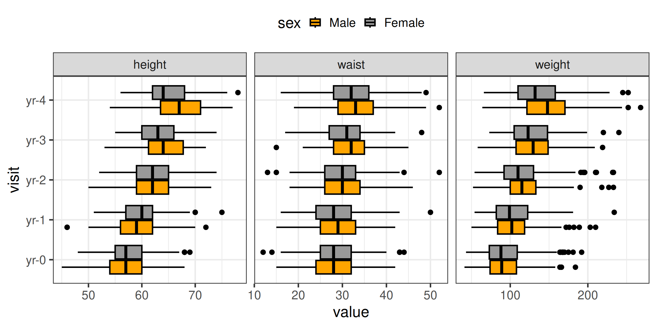
The data so far is wide: one row per participant-visit, with height, weight and waist in three separate columns. ggplot2 can only facet by a column, so it needs the data long: one row per participant-visit-measure, with a column saying which measure it is.
tidyr::pivot_longer() does that conversion:
cols = height:waist — the columns to stack (: means “height through waist”, in column order)names_to = "what" — a new column holding the old column namesvalues_to = "value" — a new column holding the numbersSo each participant-visit row becomes three rows, what says height, weight or waist, and value holds the measurement. To see it for yourself, run the pipeline up to and including pivot_longer() and then glimpse().
paste0("yr-", visit) glues a prefix onto the visit number (0 → yr-0) so the axis labels mean something without a caption.
facet_grid(~ what, scales = "free") draws one panel per value of what. The ~ what puts them in columns, side by side. scales = "free" lets each panel use its own value range — essential here, because height is in inches, weight in pounds, and on a shared axis the height boxes would be squashed into a sliver. The panels come out in alphabetical order, height–waist–weight.
The commented-out labs() block is how you would add axis titles, a title, a subtitle and a caption for a figure headed for a paper or poster. Fill it in and uncomment it.
Fill vs colour for every geom, choosing palettes, facet_grid() vs facet_wrap(), and saving a figure at print resolution with ggsave() are on the ggplot2 anatomy deep-dive.
_screen_ variablessub2 has four screen-time columns — the ones whose names contain _screen_: youth- and parent-reported, weekday and weekend. Make the same faceted boxplot for those four, one panel per screen-time measure.
Hint: copy the height/weight/waist pipeline and change the columns you select and pivot. matches("_screen_") works inside pivot_longer() too.
sub2 |>
  mutate(
    sex = factor(
      sex,
      levels = c("Male", "Female")
    )
  ) |>
  select(
    participant_id,
    visit,
    sex,
    matches("_screen_")
  ) |>
  tidyr::pivot_longer(
    cols = matches("_screen_"),
    names_to = "what",
    values_to = "value"
  ) |>
  mutate(
    visit = paste0("yr-", visit) |> factor(),
    what = stringr::str_replace(what, "__screen__", "\n")
  ) |>
  ggplot(
    aes(
      x = visit,
      y = value,
      fill = sex
    )
  ) +
  geom_boxplot(col = "black") +
  facet_grid(~ what, scales = "free") +
  coord_flip() +
  theme_bw(20) +
  scale_fill_manual(values = c("orange", "grey60")) +
  theme(
    legend.position = "top"
  )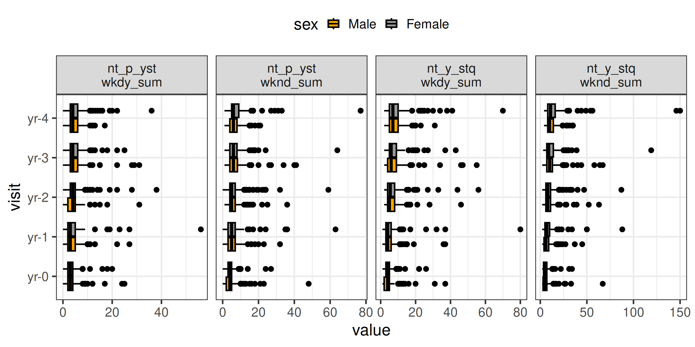
The one addition is str_replace(what, "__screen__", "\n"), which swaps the middle of each long variable name for a line break (\n) so the panel labels fit. Read nt_p_yst as the parent report and nt_y_stq as the youth’s own.
Look at how far the axes stretch. Those long tails are the implausible values from section 3 — 80 hours on a weekday — and they squash the boxes towards zero. A boxplot is often the first place a data-quality problem shows itself.
Notice too that youth report more screen time than their parents do, and weekends more than weekdays.
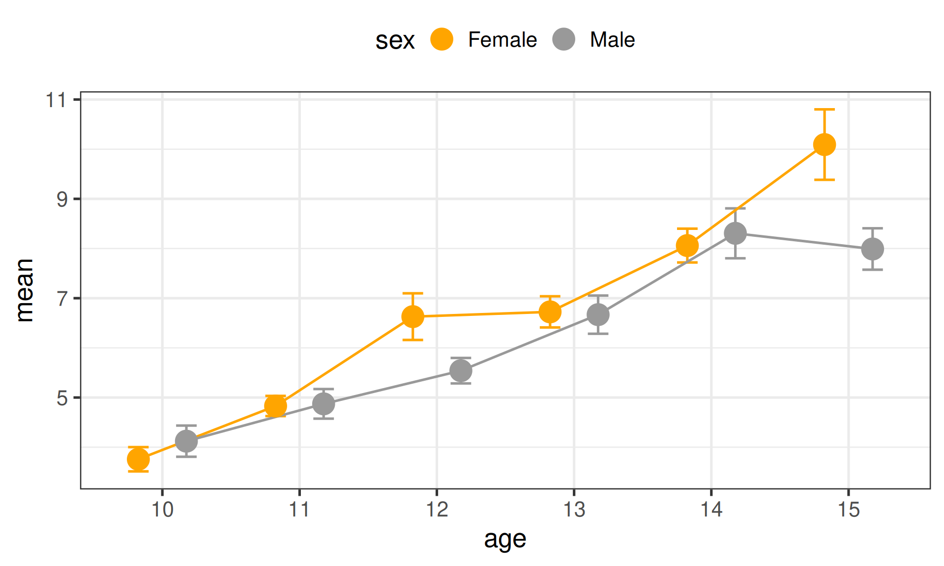
The second question: how does weekday screen time change with age, and does it differ by sex? This time we plot a summary — the mean at each age — rather than the whole distribution.
sub2 |>
  # summary()
  select(
    participant_id,
    visit,
    age,
    sex,
    screen_wkday = nt_y_stq__screen__wkdy_sum,
    screen_wknd = nt_y_stq__screen__wknd_sum,
    cbcl_int = mh_p_cbcl__synd__int_sum,
    cbcl_ext = mh_p_cbcl__synd__ext_sum
  ) |>
  # count(age)
  filter(
    age >= 10 & age <= 15,
    !is.na(screen_wkday),
    !is.na(screen_wknd),
    !is.na(cbcl_int),
    !is.na(cbcl_ext)
  ) |>
  # summary()
  mutate(
    age = factor(age)
  ) |>
  group_by(age, sex) |>
  reframe(
    n = n(),
    mean_screen_wkday = mean(screen_wkday),
    mean_screen_wknd = mean(screen_wknd),
    sd_wkday = sd(screen_wkday),
    sd_wknd = sd(screen_wknd)
  ) |>
  mutate(
    mean = mean_screen_wkday,
    sd = sd_wkday,
    se = sd / sqrt(n)
  ) |>
  ggplot(
    aes(x = age, y = mean, fill = sex, col = sex, group = sex)
  ) +
  # geom_ribbon(
  #   aes(
  #     ymin = mean - se,
  #     ymax =  mean + se
  #   ),
  #   alpha = 0.5
  # ) +
  # geom_line(
  #   size = 2,
  #   aes(col = sex)
  # ) +
  geom_errorbar(
     aes(
       ymin = mean - se,
       ymax =  mean + se
     ),
     position = position_dodge(width = 0.7),
     width = .3
  ) +
  geom_line(
    position = position_dodge(width = 0.7)
  ) +
  geom_point(
    position = position_dodge(width = 0.7),
    size = 7
  ) +
  theme_bw(20) +
  scale_color_manual(values = c("orange", "grey60")) +
  scale_fill_manual(values = c("orange", "grey60")) +
  theme(
    legend.position = "top"
  )
The longest pipeline so far. Taken in order:
Select and rename. Keep eight columns, and give the four measures short names.
Filter. age >= 10 & age <= 15 keeps ages 10 to 15 — there are very few participants at 8, 9, 16 or 17, and means from a handful of people are noisy. Run the commented-out count(age) to see why. The four !is.na(...) conditions drop rows missing any of the measures, so every mean below is computed on the same people. (! means “not”: !is.na(x) is “x is not missing”.)
age = factor(age). Age is a whole number after the rounding in section 3. Making it a factor tells ggplot2 to treat each age as its own category on the x-axis, rather than as a continuous number line.
group_by(age, sex) + reframe(). One row per age-and-sex combination, holding the count n(), the mean and the standard deviation (sd()) of weekday and weekend screen time. reframe() is a close relative of the summarise() from Module 1. Here the two give exactly the same result — use whichever you like. (summarise() would also print a message about the grouping; reframe() always returns an ungrouped table.)
se = sd / sqrt(n). The standard error of the mean. The mutate() first copies the weekday columns into generic mean and sd columns — so to plot weekend screen time instead, you change those two lines and nothing else.
The plot.
group = sex tells geom_line() which points to join — one line per sex. Without it, ggplot2 cannot tell which points belong together on a categorical x-axis. It is the same job group = 1 did in Module 1’s line chart.geom_errorbar(aes(ymin = mean - se, ymax = mean + se)) draws a bar from one standard error below the mean to one above. width = .3 is the width of the caps.position = position_dodge(width = 0.7) nudges the two sexes apart horizontally so their points and bars do not sit on top of each other. It must be the same on every layer, or the bars, lines and points drift out of alignment.geom_point(size = 7) — the means themselves, drawn large.In Q1, males were orange. Here, females are. This pipeline never sets the factor order of sex, so R sorts the text alphabetically — Female before Male — and scale_*_manual() hands out colours in that order.
To make the colours consistent across figures, add the same mutate(sex = factor(sex, levels = c("Male", "Female"))) step from Q1. Setting the level order once, early in the pipeline, is the reliable fix.
The commented-out geom_ribbon() + geom_line() pair is an alternative way to show the same numbers: a shaded band for ± 1 SE instead of bars, the usual style when x is a continuous variable. (If you uncomment it, change size = 2 to linewidth = 2 — size for lines is deprecated in current ggplot2.)
A plot of means is a picture of a table. Stop the same pipeline before ggplot() to see that table:
sub2 |>
  select(
    age,
    sex,
    screen_wkday = nt_y_stq__screen__wkdy_sum
  ) |>
  filter(
    age >= 10 & age <= 15,
    !is.na(screen_wkday)
  ) |>
  group_by(age, sex) |>
  summarise(
    n    = n(),
    mean = mean(screen_wkday),
    sd   = sd(screen_wkday),
    se   = sd / sqrt(n),
    .groups = "drop"
  ) |>
  mutate(across(mean:se, ~ round(.x, 2)))
# A tibble: 12 × 6
age sex n mean sd se
<dbl> <chr> <int> <dbl> <dbl> <dbl>
1 10 Female 146 3.76 2.84 0.24
2 10 Male 133 4.11 3.6 0.31
3 11 Female 189 4.75 2.63 0.19
4 11 Male 163 4.84 3.68 0.29
5 12 Female 254 6.59 7.23 0.45
6 12 Male 231 5.5 3.83 0.25
7 13 Female 216 6.73 4.45 0.3
8 13 Male 167 6.65 4.86 0.38
9 14 Female 223 8.05 4.98 0.33
10 14 Male 191 8.19 6.68 0.48
11 15 Female 102 10.1 6.95 0.69
12 15 Male 110 7.93 4.27 0.41(The counts differ slightly from the plot’s, because this version only requires weekday screen time to be present, not all four measures.)
This is a descriptive statistics table, and it is often what a paper’s Table 1 is built from. Two numbers there describe spread, and they are easy to confuse:
Non-overlapping error bars are not a test of whether two groups differ, and overlapping ones do not show that they are the same. Whether the gap between girls and boys at 15 is more than noise is a question for a hypothesis test — which is exactly what Module 3 is about.
The Q2 pipeline already carries cbcl_int, the parent-reported CBCL internalizing score. Make the mean ± SE plot for cbcl_int by age and sex instead of screen time. Set the sex level order so that males are orange, as in Q1.
sub2 |>
  select(
    age,
    sex,
    cbcl_int = mh_p_cbcl__synd__int_sum
  ) |>
  filter(
    age >= 10 & age <= 15,
    !is.na(cbcl_int)
  ) |>
  mutate(
    age = factor(age),
    sex = factor(sex, levels = c("Male", "Female"))
  ) |>
  group_by(age, sex) |>
  reframe(
    n = n(),
    mean = mean(cbcl_int),
    sd = sd(cbcl_int),
    se = sd / sqrt(n)
  ) |>
  ggplot(
    aes(x = age, y = mean, fill = sex, col = sex, group = sex)
  ) +
  geom_errorbar(
    aes(
      ymin = mean - se,
      ymax = mean + se
    ),
    position = position_dodge(width = 0.7),
    width = .3
  ) +
  geom_line(
    position = position_dodge(width = 0.7)
  ) +
  geom_point(
    position = position_dodge(width = 0.7),
    size = 7
  ) +
  theme_bw(20) +
  scale_color_manual(values = c("orange", "grey60")) +
  scale_fill_manual(values = c("orange", "grey60")) +
  labs(
    x = "Age (years)",
    y = "CBCL internalizing (mean ± SE)"
  ) +
  theme(
    legend.position = "top"
  )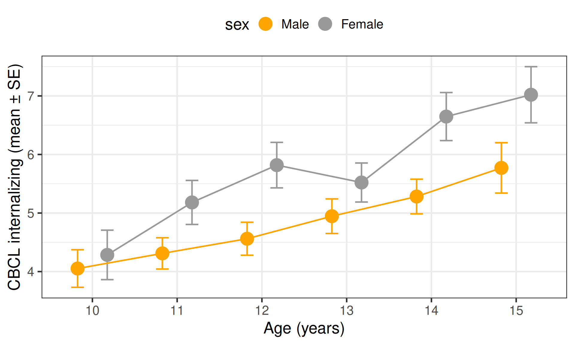
Only the measure changed, plus the sex level order and a labs() layer for proper axis titles. The whole structure — filter, group, summarise, compute SE, plot with dodged error bars — is reusable for any continuous measure in the dataset.
Reusable enough that copy-pasting it starts to feel wrong. The functions deep-dive turns it into a single line.
Six exercises to work through on your own time, using parts of the dataset the session did not touch.
All of them start from data and levels_dict as loaded in sections 1 and 3, and the dataset page is your reference for what each column means.
ab_g_dyn__visit_type records whether a visit was on-site, remote or hybrid — but as the codes 1, 2, 3. Label it using levels_dict, then count how many visits of each type happened at each session. At which session were remote visits most common?
SOLUTION CODE WILL BE PROVIDED NEXT WEEK.
# A tibble: 5 × 4
  session_id `On-site` Remote Hybrid
  <fct>          <int>  <int>  <int>
1 ses-00A          500      0      0
2 ses-01A          477      7      0
3 ses-02A          329     73     56
4 ses-03A           61    350     28
5 ses-04A          154     47    213
Every baseline visit was on-site. Remote visits peak sharply at ses-03A, the 3-year follow-up — the kind of pattern you see when outside events (a pandemic, say) interrupt data collection partway through a study.
pivot_wider() spreads the counts into one column per visit type so the table reads like a crosstab. values_fill = 0 writes 0 rather than NA where a combination never happened.
Using your labelled visit_type from T1, work out the percentage of height, weight and waist measurements that are missing for each visit type. Show it as a bar chart.
Hint: mean(is.na(x)) is the proportion missing — is.na() gives TRUE/FALSE, and the mean of those is the share that are TRUE.
SOLUTION CODE WILL BE PROVIDED NEXT WEEK.
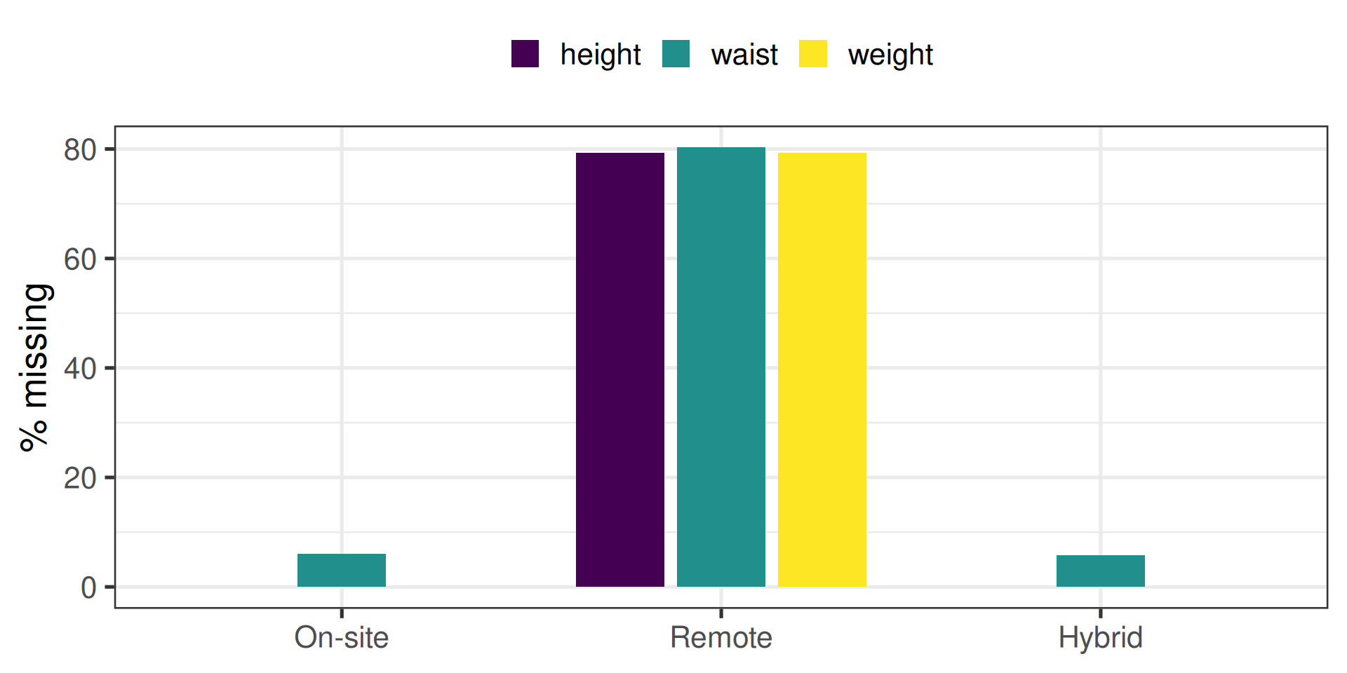
Remote visits are missing about 80% of their body measurements. On-site and hybrid visits have no missing height or weight at all, and only about 6% missing waist. Nobody can measure a child’s height over video.
This is structured missingness: whether a value is missing depends on something else you know about the visit. Drop the incomplete rows and you drop remote visits disproportionately — which, from T1, means you drop the 3-year follow-up disproportionately. Module 3 takes this up.
The dataset has four screen-time columns: parent- and youth-reported, weekday and weekend. Make one figure showing the mean ± SE at each session, with reporter as colour and weekday/weekend as facets.
Steps:
_screen_ columns, and pivot them long.reporter (Parent if the name contains _p_, otherwise Youth) and day (Weekday if it contains wkdy, otherwise Weekend). stringr::str_detect() tells you whether a string contains a pattern.SOLUTION CODE WILL BE PROVIDED NEXT WEEK.
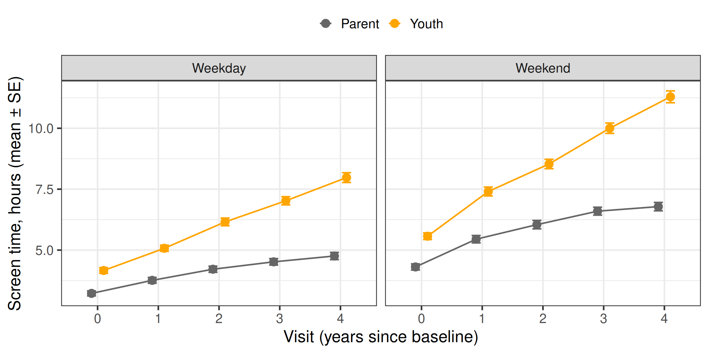
filter(hours <= 24) also removes NAs, because NA <= 24 is NA and filter() only keeps rows where the condition is TRUE. Handy, but worth knowing that it happens.
Children report more screen time than their parents do at every visit, and the gap grows as they get older — plausibly because parents see less of it. Which report is “right” is not a question the data can answer, and it is exactly why ABCD collects both.
The facets share a y-axis here (no scales = "free"), because both panels are in hours and the weekday–weekend comparison is part of the point.
At baseline only, compare the NIH Toolbox crystallized composite (nc_y_nihtb__comp__cryst__agecorr_score) across the three household income bands (ab_g_dyn__cohort_income__hhold__3lvl). Make a boxplot and a table of n, mean and SD per band.
The income variable includes the codes 777 (decline to answer) and 999 (don’t know). Decide what to do with them, and write one sentence saying why.
SOLUTION CODE WILL BE PROVIDED NEXT WEEK.
# A tibble: 3 × 4
  income          n  mean    sd
  <fct>       <int> <dbl> <dbl>
1 < 50k         129  104.  12.9
2 50k to 100k    94  107.  13.3
3 > 100k 218 114. 14 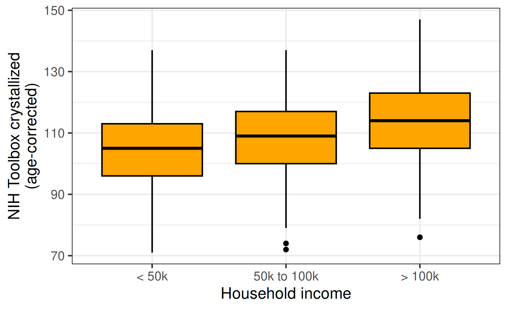
This solution drops 777 and 999: they are not income bands, and they cannot sit on an ordered low-to-high axis. That is a defensible choice, not the only one — keeping them as their own category would let you check whether people who decline to answer differ from everyone else, which matters if you later want to generalise. Whatever you choose, say so in your methods.
droplevels() removes the now-empty factor levels, so the plot does not show blank slots for them.
The medians rise with income. Whether that difference is bigger than chance would produce, and whether it survives accounting for site, is a job for Module 3 — a boxplot describes, it does not test.
Mean ± SE plots hide the individuals. Plot mean cortical thickness (mr_y_smri__thk__dsk_mean) against age for 30 randomly chosen participants, one faint line per person, with the average at each session drawn on top.
Hints: pick the 30 IDs first with distinct() and slice_sample(), then filter(participant_id %in% ...). For one line per person, map group = participant_id. A second layer can take its own data: geom_line(data = other_table, ...).
SOLUTION CODE WILL BE PROVIDED NEXT WEEK.
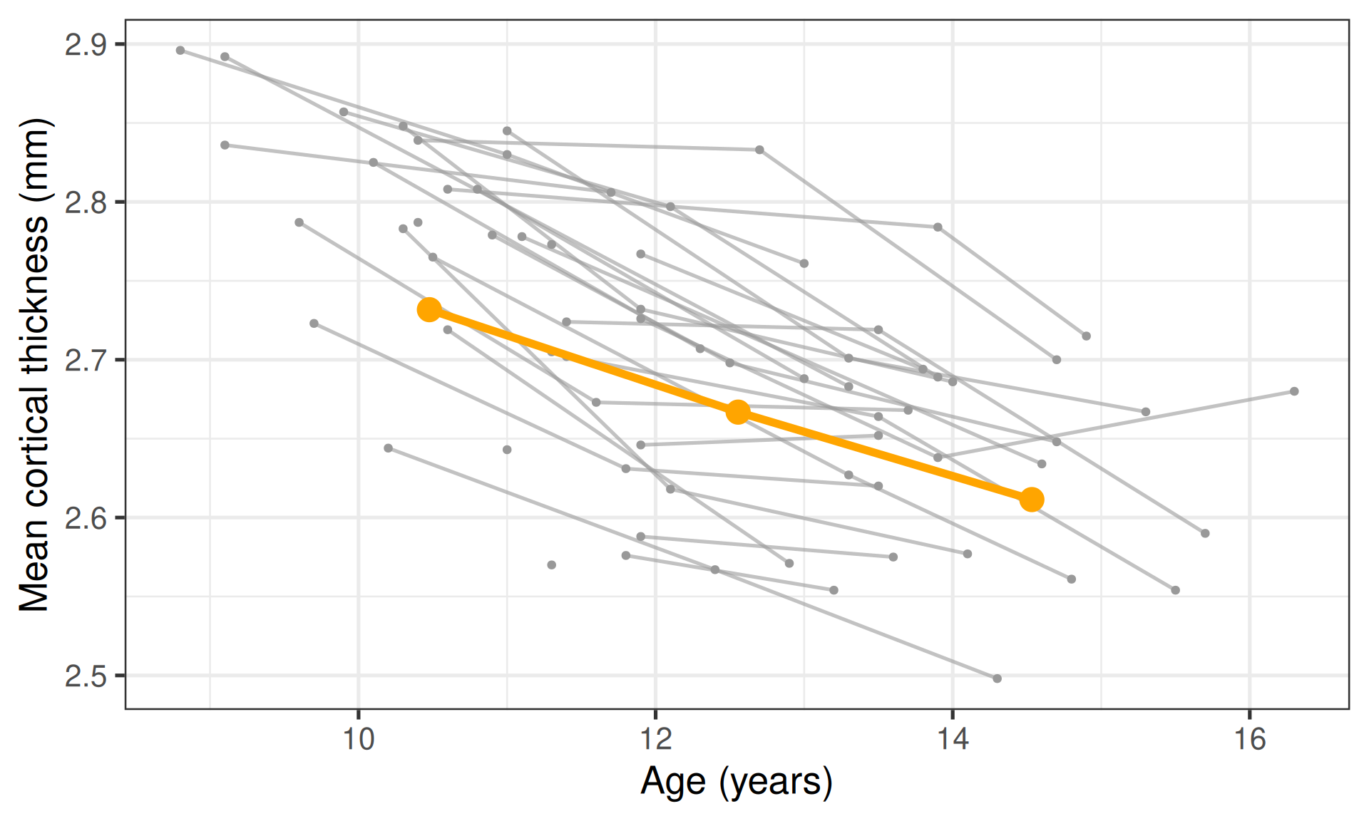
set.seed() fixes R’s random number generator, so slice_sample() picks the same 30 people every run — essential for anything you want to reproduce.
MRI was only collected at baseline, year 2 and year 4, which is why each person has at most three points (and the average has three). Nearly every individual line slopes downward, at broadly similar rates, but they start at very different heights: people differ a lot in level, rather less in slope. That observation is the core idea behind the mixed-effects models used for longitudinal data — a reason Module 3 cannot treat these rows as independent.
Almost every paper opens with a table describing the sample. Build one for the baseline visit, by sex: n, and mean (SD) of age, height, weight, youth weekday screen time, and CBCL internalizing and externalizing.
Aim for one row per variable and one column per sex, with cells that read like 10.1 (0.6).
Hint: this is summarise(across(..., list(mean = ..., sd = ...))), then a pivot_longer() and a pivot_wider(). names_sep in pivot_longer() can split a name like age_mean into two columns.
SOLUTION CODE WILL BE PROVIDED NEXT WEEK.
# A tibble: 6 × 3
  variable Female      Male
  <chr>    <chr>       <chr>
1 age      10.5 (0.9)  10.5 (0.9)
2 height   57.6 (4.2)  56.6 (4.2)
3 weight   93.0 (27.6) 91.8 (25.8)
4 screen   4.3 (2.9)   4.4 (3.8)
5 cbclint  4.7 (5.0)   4.2 (3.9)
6 cbclext  3.3 (4.0)   5.0 (4.7)
Three reshapes in a row, so step through it: run the pipeline one line at a time and glimpse() after each step.
across() with a named list() makes columns like age_mean, age_sd.pivot_longer(names_sep = "_") splits each name at the _ into variable and stat. That is why the new columns are named cbclint rather than cbcl_int: an extra underscore would split in the wrong place.pivot_wider() puts mean and sd side by side so sprintf() can format them into "10.1 (0.6)". %.1f means “a number with one decimal place”, and unlike round() it keeps a trailing zero: 5.0, not 5.pivot_wider() gives one column per sex.transmute() is mutate() that keeps only the columns it creates — a compact select-and-rename for when every column needs a new name.
For a table going straight into a manuscript, packages such as gtsummary build this in one call. Building it by hand once is how you learn what those packages are doing.
.RDS file and explain why it beats a CSV for R-to-R workpackage::function() without loading the packagecase_when(), and transform many columns at once with across()left_join(), and check that the join workedpivot_longer(), and facet by the resultThe following recording is of the live workshop hosted on Sep 24, 2026.
The topics covered during the live session is a smaller subset of all the materials displayed above. We highly recommend you go through this entire page and the exercises to get comfortable with the contents / topics of Module 2.
Optional, and none of it is assumed in Module 3:
across(), recoding, joins, reshaping, and labelling every coded variable at onceNext: Module 3 · Inferential Statistics → on Oct 29, where the question moves from “what does the data look like?” to “is this difference real?”.