Optional. A reference for the plots that come up most often, on the same synthetic data. Module 2 covers this properly; this page is here so you can copy something that works today.
library(readr)library(dplyr)
Attaching package: 'dplyr'
The following objects are masked from 'package:stats':

    filter, lag
The following objects are masked from 'package:base':

    intersect, setdiff, setequal, union
── Column specification ────────────────────────────────────────────────────────
Delimiter: ","
chr (4): subject_id, visit, site, sex
dbl (5): age_months, total_problems, cognition_score, screen_time_hrs, sleep...

ℹ Use `spec()` to retrieve the full column specification for this data.
ℹ Specify the column types or set `show_col_types = FALSE` to quiet this message.
Note the factor() line — it fixes the visit order once, so every plot below comes out chronological rather than alphabetical. See the data types deep-dive for why.
The grammar, in one paragraph
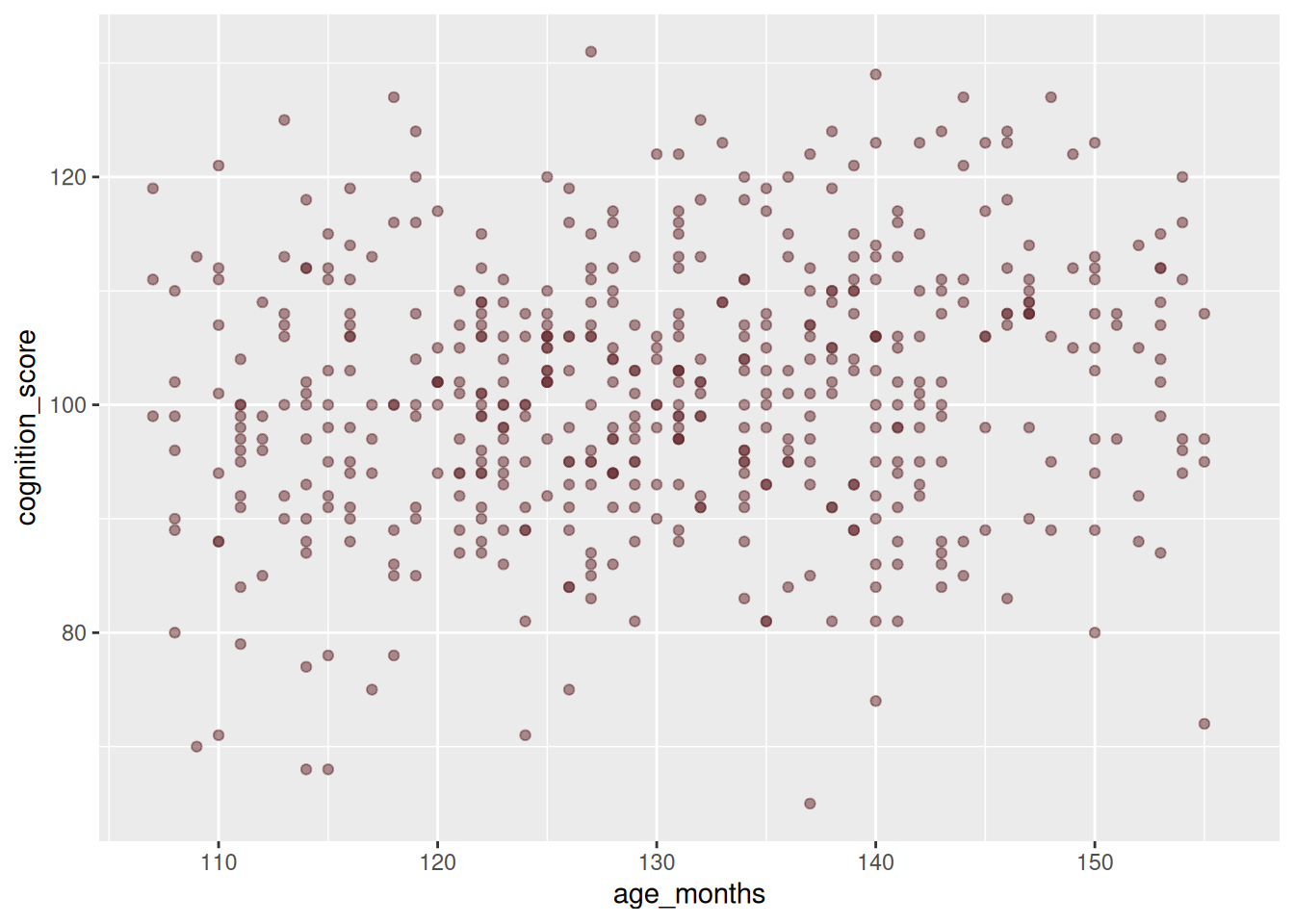
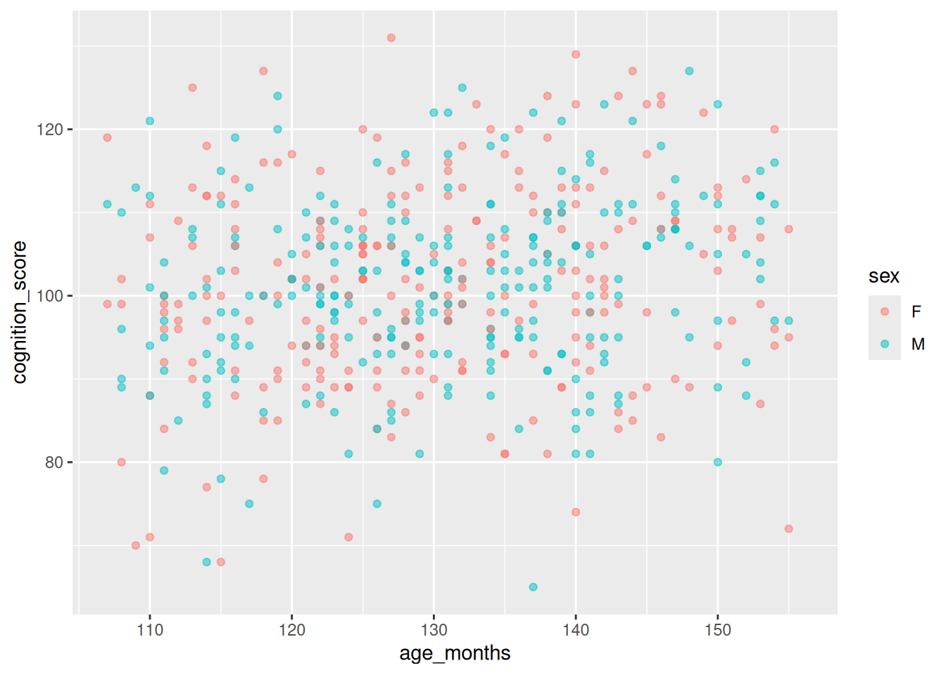
Every ggplot is ggplot(data, aes(...)) plus one or more geom_*() layers joined with +. aes() maps columns to visual properties — x, y, colour, fill, size, shape. Anything you set outsideaes() is a fixed constant; anything inside varies with the data. That distinction is the single most common source of confusion:
# colour OUTSIDE aes() -- one fixed colourggplot(abcd, aes(x = age_months, y = cognition_score)) +geom_point(colour ="#62272D", alpha =0.5)# colour INSIDE aes() -- varies by column, legend appearsggplot(abcd, aes(x = age_months, y = cognition_score, colour = sex)) +geom_point(alpha =0.5)
Figure 1: Left: colour fixed. Right: colour mapped to a column.
Figure 2: Left: colour fixed. Right: colour mapped to a column.
One continuous variable
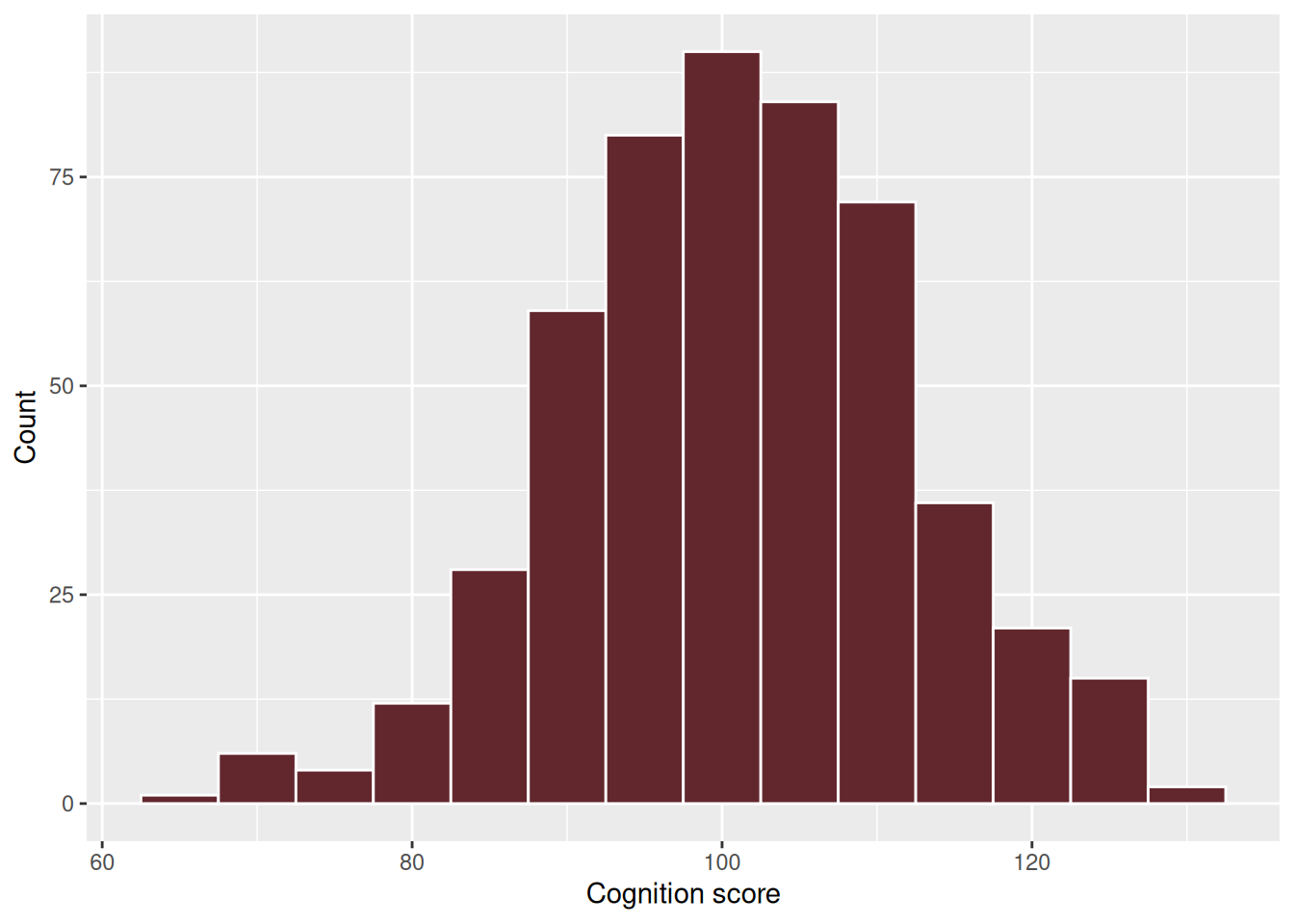
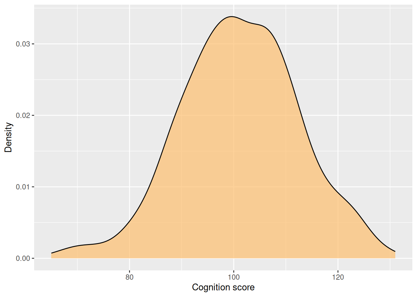
ggplot(abcd, aes(x = cognition_score)) +geom_histogram(binwidth =5, fill ="#62272D", colour ="white") +labs(x ="Cognition score", y ="Count")ggplot(abcd, aes(x = cognition_score)) +geom_density(fill ="#FDBF6F", alpha =0.7) +labs(x ="Cognition score", y ="Density")
Figure 3: Histogram and density for the same variable
Figure 4: Histogram and density for the same variable
binwidth is worth setting deliberately. Leave it out and ggplot2 picks 30 bins and warns you about it; the right value depends on your data and is a judgement call, so try a few.
One continuous, one categorical
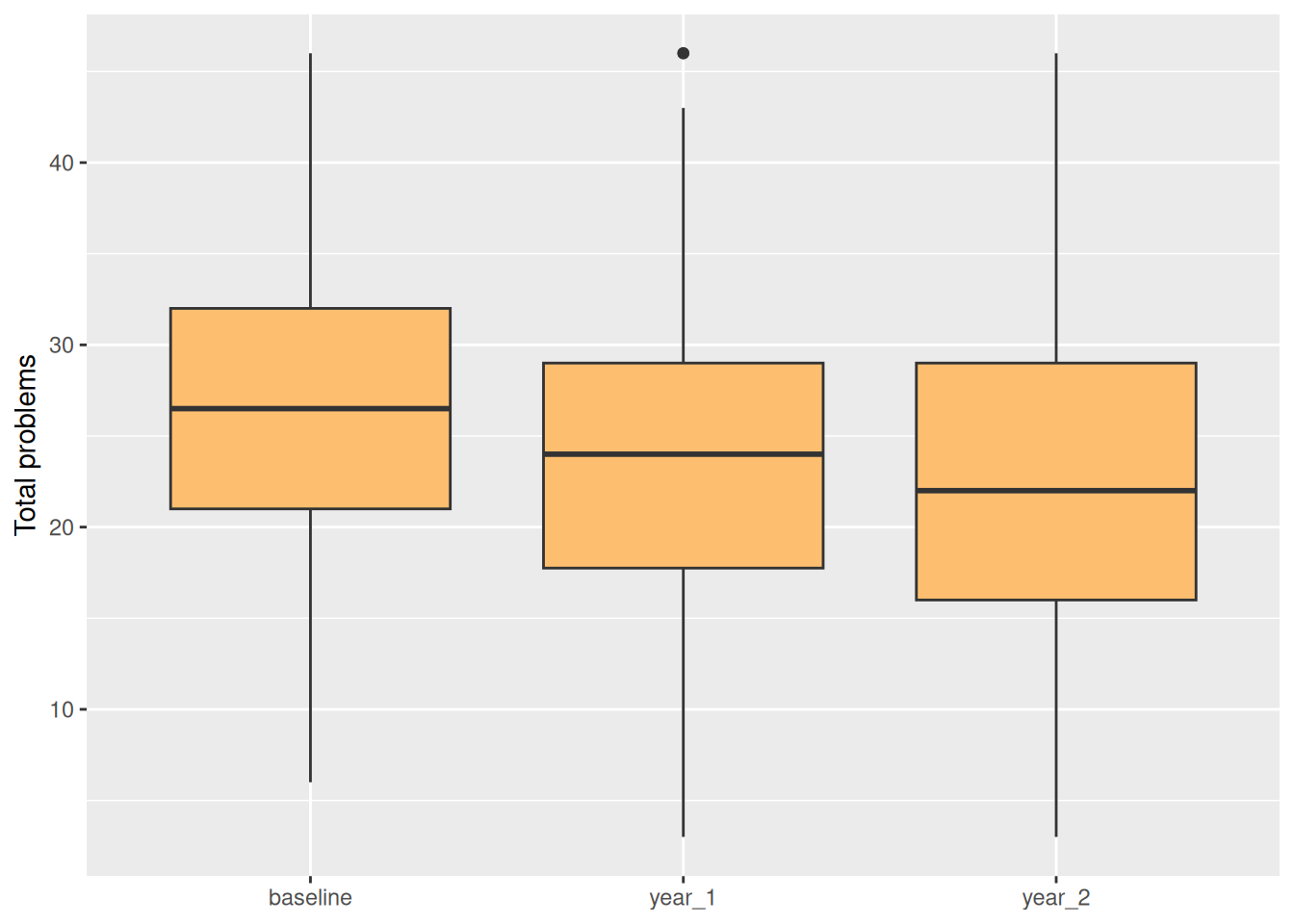
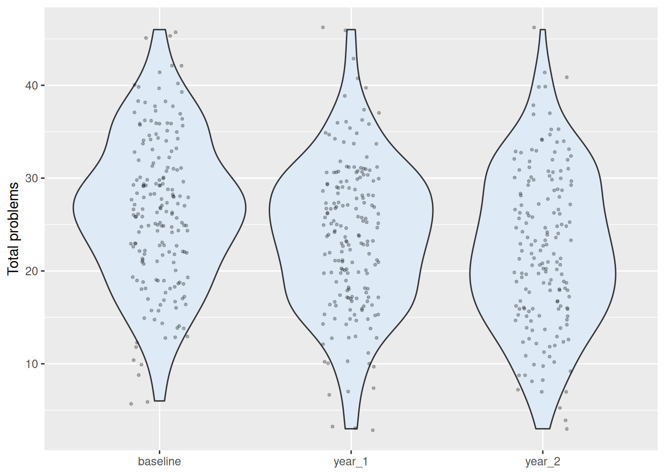
ggplot(abcd, aes(x = visit, y = total_problems)) +geom_boxplot(fill ="#FDBF6F") +labs(x =NULL, y ="Total problems")ggplot(abcd, aes(x = visit, y = total_problems)) +geom_violin(fill ="#DEEBF7") +geom_jitter(width =0.15, alpha =0.25, size =0.7) +labs(x =NULL, y ="Total problems")
Figure 5: Boxplot, and a violin with the raw points overlaid
Figure 6: Boxplot, and a violin with the raw points overlaid
The right-hand version shows the actual sample size and any clumping, which a boxplot hides. With a few hundred points it is usually the more honest choice.
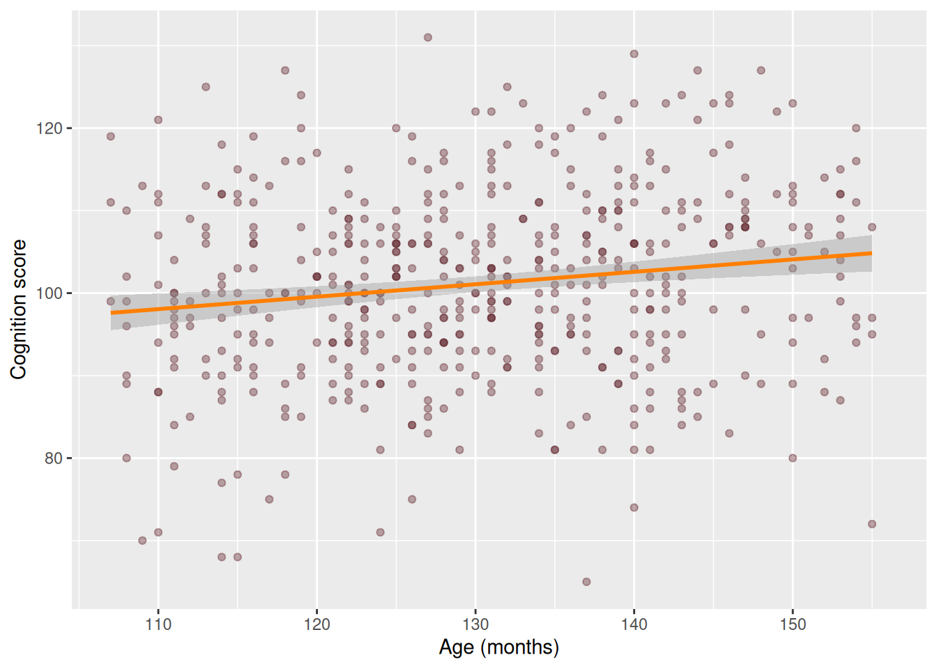
geom_smooth(method = "lm") draws a straight-line fit with a confidence band. Leave method out and you get a wiggly loess curve instead, which is better for “is there any pattern here at all?” and worse for “is this trend linear?”.
Warning
Drawing a trend line is not the same as testing one. This picture has no p-value and makes no claim. Module 3 is where fitted lines become inference.
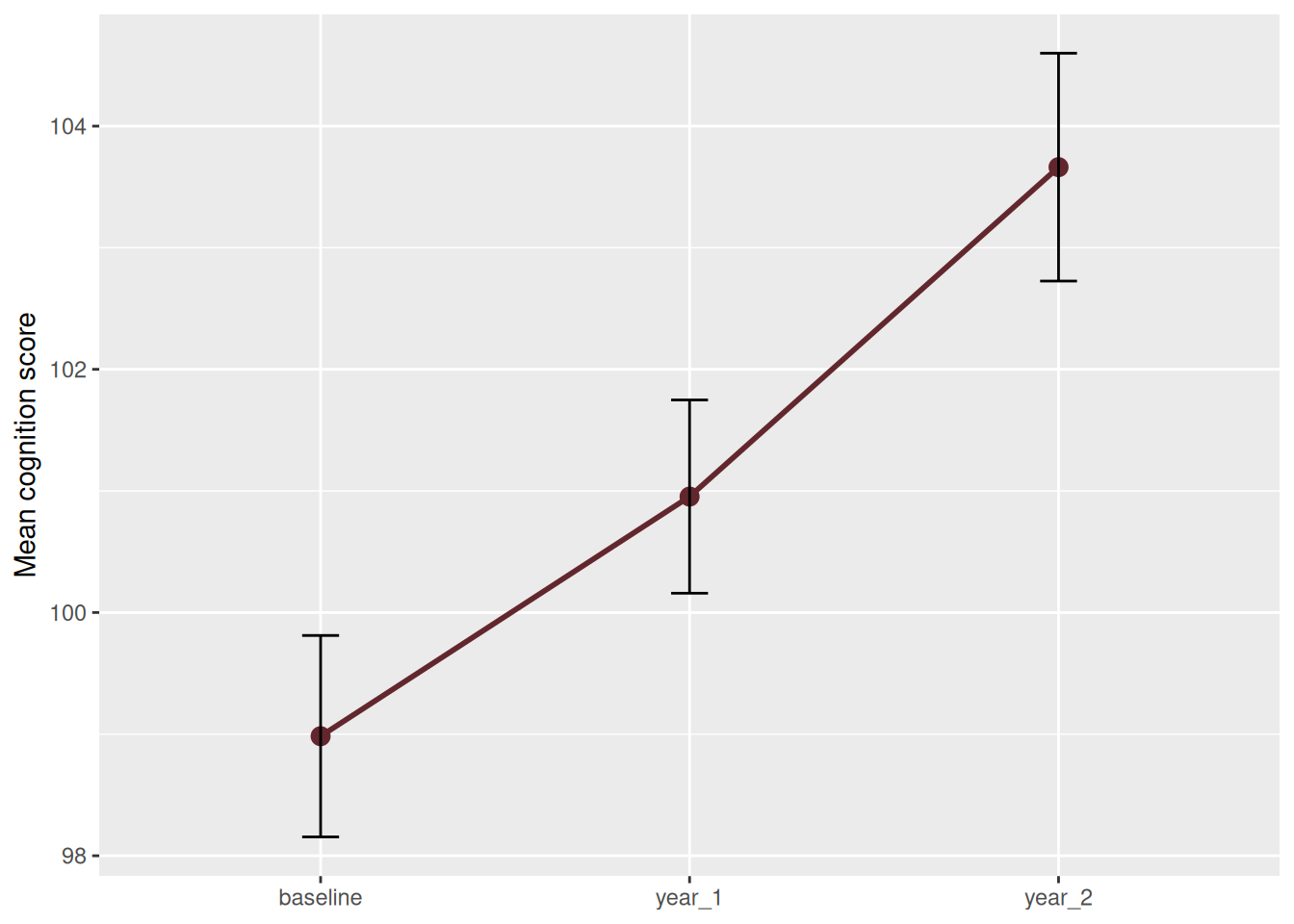
Figure 8: Mean cognition score by visit, with standard-error bars
Individual trajectories — one line per participant, the spaghetti plot:
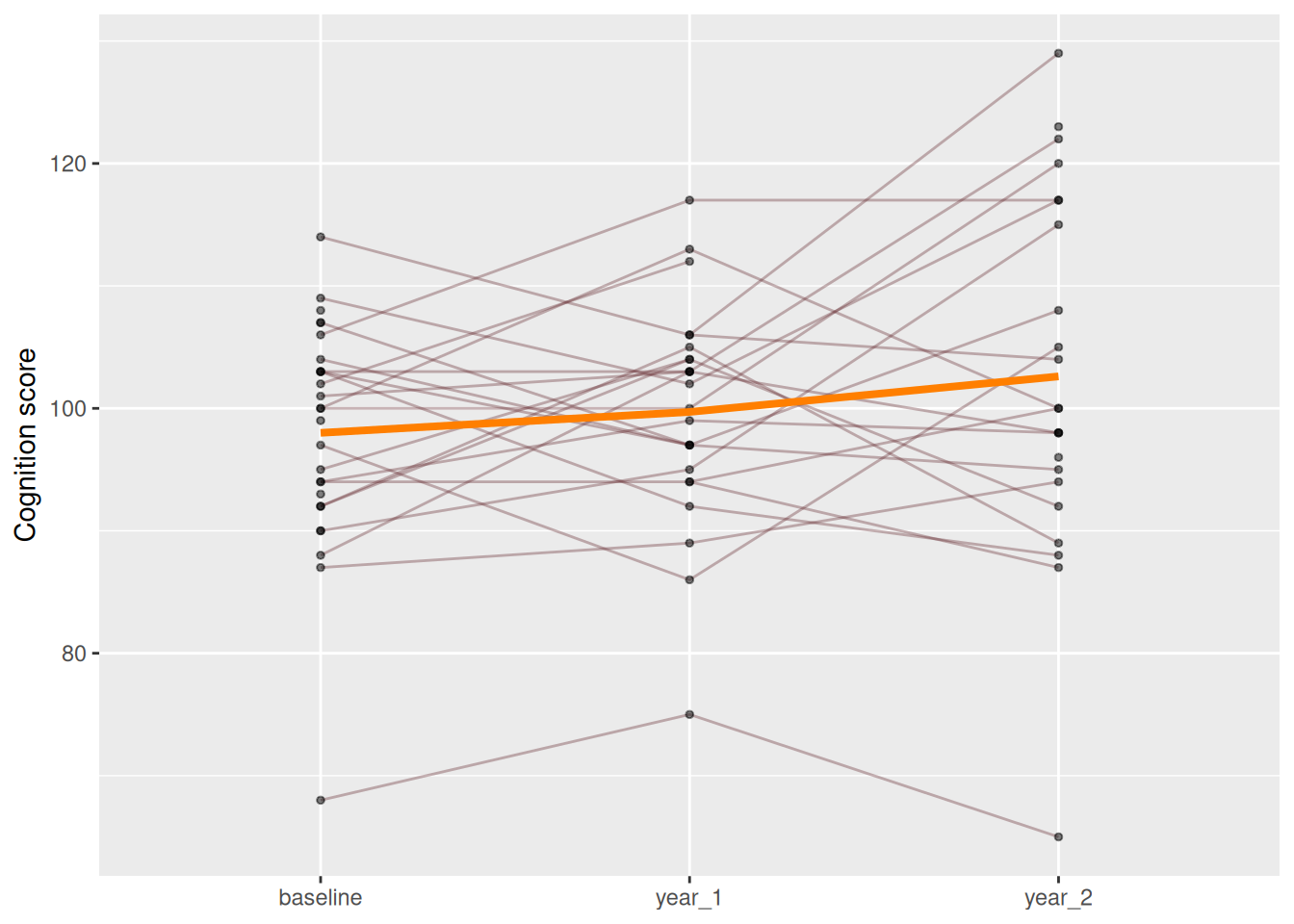
set.seed(1)some_ids <-sample(unique(abcd$subject_id), 30)abcd |>filter(subject_id %in% some_ids) |>ggplot(aes(x = visit, y = cognition_score, group = subject_id)) +geom_line(alpha =0.35, colour ="#62272D") +geom_point(alpha =0.5, size =1) +stat_summary(aes(group =1), fun = mean, geom ="line",colour ="#FF7F00", linewidth =1.4) +labs(x =NULL, y ="Cognition score")
Figure 9: Individual trajectories for 30 participants
This is the plot that makes longitudinal data feel real. The orange average rises gently; individual children go up, down and sideways. Any analysis that treats these 90 points as independent observations is wrong, and that is precisely the problem Module 3 takes on.
Note group = subject_id: it tells ggplot2 which points belong to the same person. Without it you get one meaningless zigzag.
Small multiples
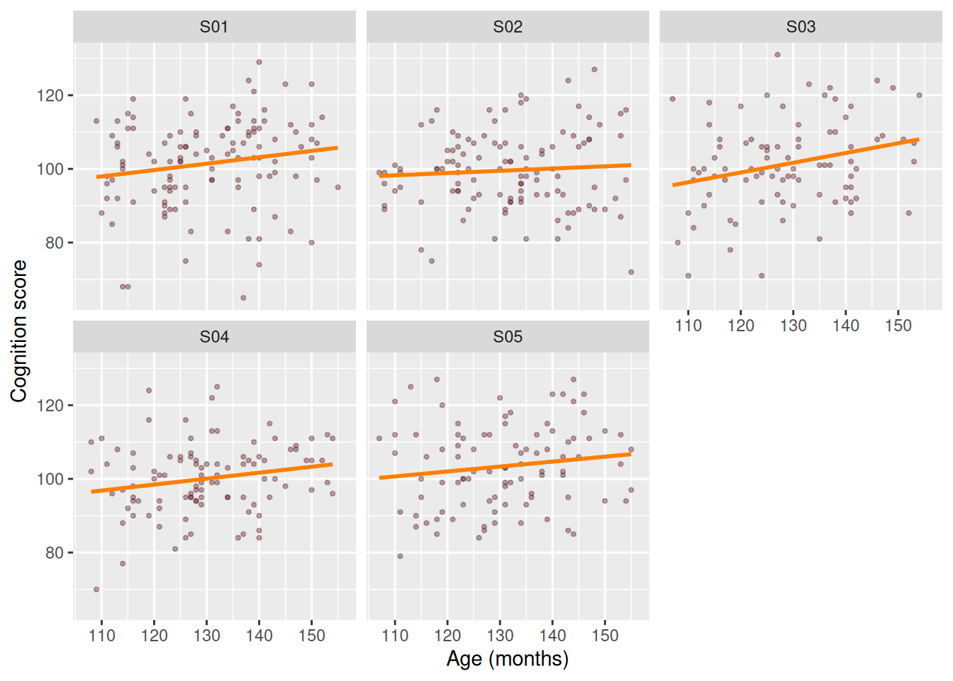
facet_wrap() splits one plot into a panel per group. Usually clearer than cramming four colours into one panel:
ggplot(abcd, aes(x = age_months, y = cognition_score)) +geom_point(alpha =0.4, size =0.8, colour ="#62272D") +geom_smooth(method ="lm", se =FALSE, colour ="#FF7F00") +facet_wrap(~ site) +labs(x ="Age (months)", y ="Cognition score")
Figure 10: Cognition against age, faceted by site
~ site is a formula — read ~ as “by”. The same notation appears throughout R’s modelling functions in Module 3.
Counts
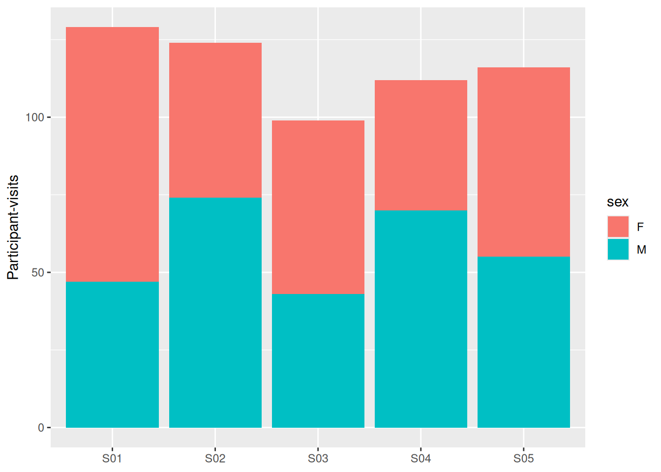
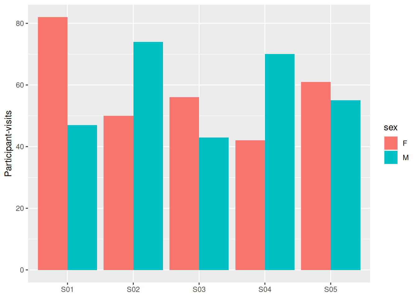
ggplot(abcd, aes(x = site, fill = sex)) +geom_bar() +labs(x =NULL, y ="Participant-visits")ggplot(abcd, aes(x = site, fill = sex)) +geom_bar(position ="dodge") +labs(x =NULL, y ="Participant-visits")
Figure 11: Stacked and side-by-side bars for the same counts
Figure 12: Stacked and side-by-side bars for the same counts
Stacked bars are good for totals, bad for comparing the parts. position = "dodge" is better when the comparison between groups is the point.
Making it presentable
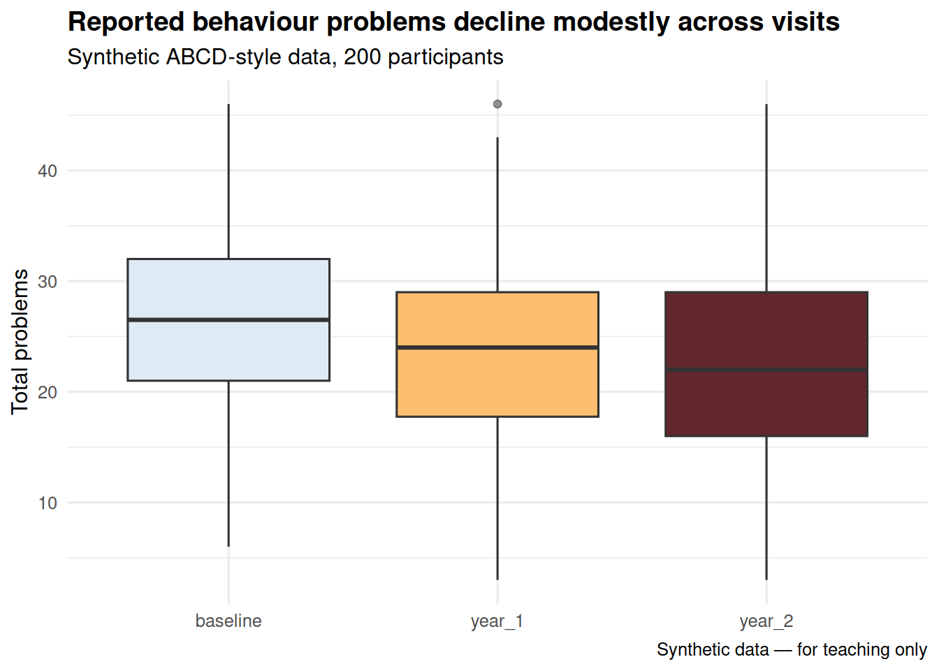
A plot for yourself needs nothing. A plot for a poster needs labels, a theme, and a deliberate size:
ggplot(abcd, aes(x = visit, y = total_problems, fill = visit)) +geom_boxplot(show.legend =FALSE, outlier.alpha =0.3) +scale_fill_manual(values =c("#DEEBF7", "#FDBF6F", "#62272D")) +labs(title ="Reported behaviour problems decline modestly across visits",subtitle ="Synthetic ABCD-style data, 200 participants",x =NULL,y ="Total problems",caption ="Synthetic data — for teaching only" ) +theme_minimal(base_size =12) +theme(plot.title =element_text(face ="bold"))
Figure 13: The same data, tidied up for presentation
Then save it at a size and resolution a journal will accept:
ggsave() saves the last plot drawn. Set width and height in inches — resizing a saved PNG afterwards makes the text blurry, whereas re-saving at the right size does not.
Back to Module 1, or on to Module 2 where this becomes the main event.