Module 2 built its figures quickly, in a live session. This page slows down and takes the pieces apart. For a tour of which geom to use for which kind of data, see the plot gallery; this page is about the parts every figure shares.
library(dplyr)
Attaching package: 'dplyr'
The following objects are masked from 'package:stats':

    filter, lag
The following objects are masked from 'package:base':

    intersect, setdiff, setequal, union
Every ggplot2 figure is the same few components, added with +:
Component
Job
Module 2 example
data + aes()
which columns map to which visual property
aes(x = visit, y = waist, fill = sex)
geom_*()
what marks to draw
geom_boxplot()
scale_*()
how values become colours, positions, sizes
scale_fill_manual()
facet_*()
split into panels
facet_grid(~ what)
coord_*()
the coordinate system
coord_flip()
theme*(), labs()
everything that is not data: fonts, grid, legend, titles
theme_bw(20)
You can add them in almost any order. Module 2 put theme_bw(20) before the geom in one plot and after it in another, and the results are the same. The one exception: theme() tweaks must come after a complete theme like theme_bw(), or the complete theme overwrites them.
Fill vs colour
Two aesthetics, easily confused:
colour (or col, or color) — lines, points, and the outline of shapes
fill — the inside of shapes: bars, boxes, violins, ribbons, and points with shapes 21–25
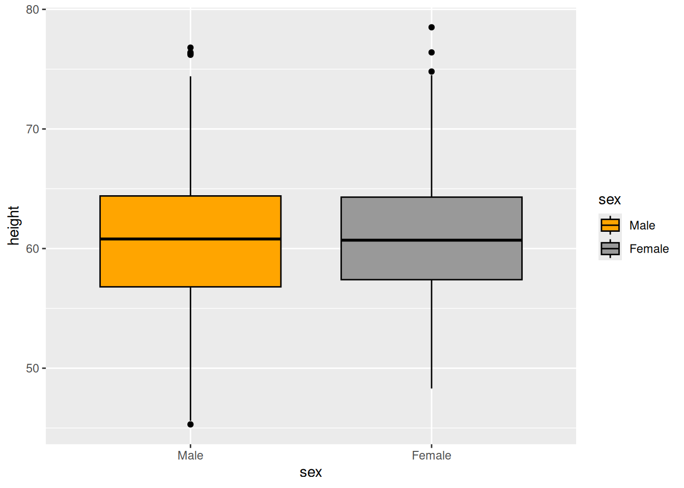
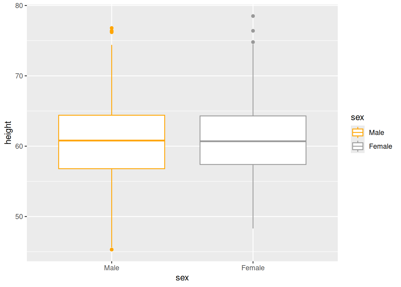
anthro |>ggplot(aes(x = sex, y = height, fill = sex)) +geom_boxplot(col ="black") +scale_fill_manual(values =c("orange", "grey60"))anthro |>ggplot(aes(x = sex, y = height, colour = sex)) +geom_boxplot() +scale_colour_manual(values =c("orange", "grey60"))
Figure 1: Left: sex mapped to fill. Right: sex mapped to colour.
Figure 2: Left: sex mapped to fill. Right: sex mapped to colour.
That is why Module 2 mapped bothfill = sex and col = sex, then set col = "black" in geom_boxplot(): fill carries the grouping, and a fixed black outline keeps the boxes crisp. Setting an aesthetic insideaes() maps it to a column; setting it outside fixes it to one value for the whole layer.
Scales: choosing the colours
Every mapped aesthetic has a scale, and every scale has a default. You override it with a scale_<aesthetic>_<type>():
scale_fill_manual(values = c(...)) — you choose. Colours are handed out in the order of the factor’s levels, so fix the level order first (Module 2’s “why are the colours swapped?” callout is this rule in action). Name them to make the mapping explicit and immune to ordering: values = c(Male = "orange", Female = "grey60").
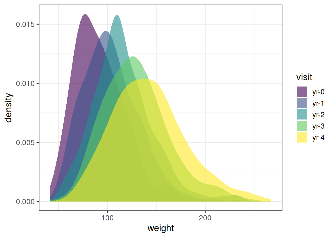
scale_fill_viridis_d() — the viridis palettes: perceptually even, legible in greyscale, and distinguishable with the common forms of colour blindness. _d for discrete data, _c for continuous.
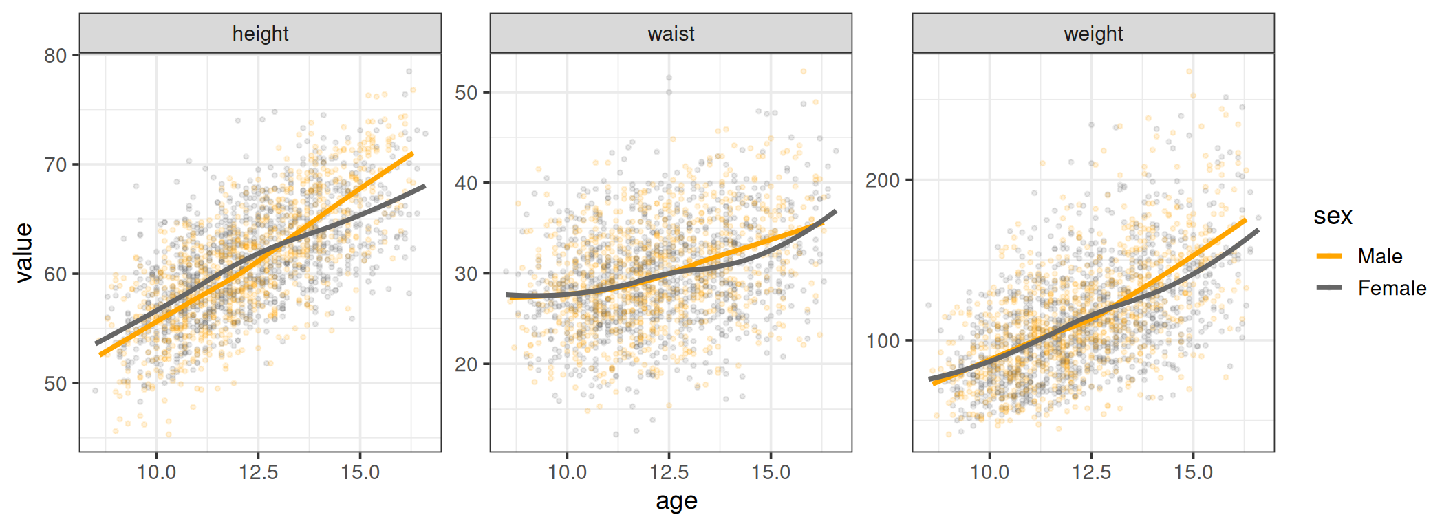
Figure 4: Growth curves, one panel per measure, with free y-axes
Free scales are right when the panels are in different units, as here. When the panels share a unit and you want readers to compare across them, keep the scales fixed. Otherwise identical-looking panels can hide very different values.
Notecoord_flip() and free scales
In Module 2, facet_grid(~ what, scales = "free") combined with coord_flip() gave each panel its own value axis, even though the value axis ended up horizontal. Scales belong to the aesthetic (y = value), not to the screen direction, so they flip along with the coordinates.
Dodging
When two groups share an x position, their marks land on top of each other. Position adjustments move them:
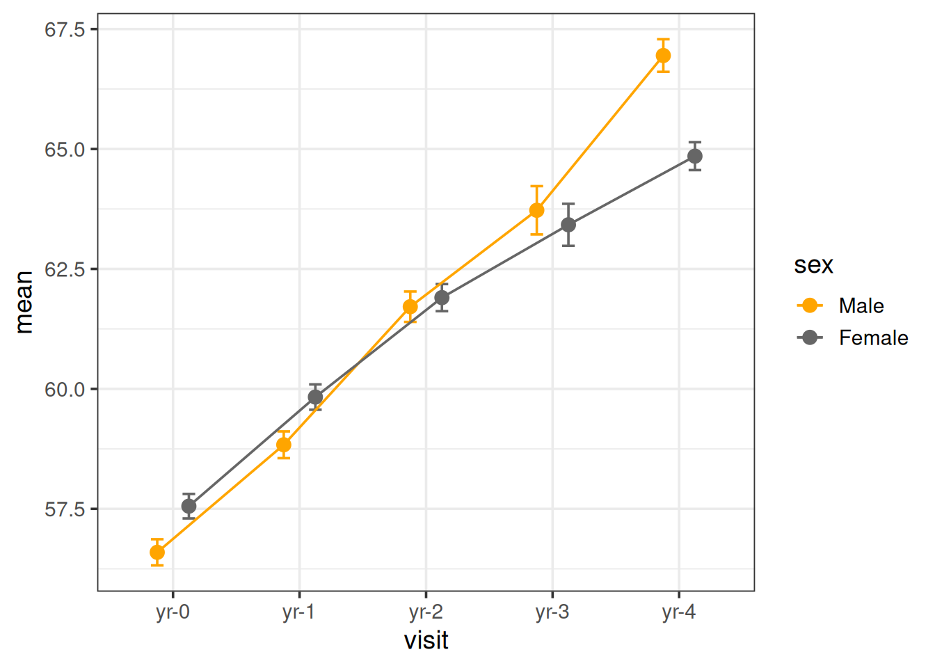
position_dodge(width = ) — side by side. Module 2 used it for points, lines and error bars.
position_jitter() — a small random shift, for showing raw points without overplotting (geom_jitter() is shorthand).
position_stack() / position_fill() — stacked bars, the default for geom_bar().
For dodging, the width must match across every layer that should line up. Build it once and reuse it:
dodge <-position_dodge(width =0.5)anthro |>group_by(visit, sex) |>summarise(n =sum(!is.na(height)),mean =mean(height, na.rm =TRUE),se =sd(height, na.rm =TRUE) /sqrt(n),.groups ="drop" ) |>ggplot(aes(x = visit, y = mean, colour = sex, group = sex)) +geom_errorbar(aes(ymin = mean - se, ymax = mean + se), width =0.2, position = dodge) +geom_line(position = dodge) +geom_point(size =3, position = dodge) +scale_colour_manual(values =c(Male ="orange", Female ="grey40")) +theme_bw(14)
Figure 5: One dodge object shared by three layers
Themes and labels
theme_bw(base_size = 20) sets a complete look and a base font size in one call; every text element scales from it. Other complete themes: theme_minimal(), theme_classic() (no grid, a common journal style), theme_light().
theme() then adjusts individual elements. The ones you will reach for most:
theme(legend.position ="top", # or "bottom", "none", or c(0.9, 0.1)panel.grid.minor =element_blank(), # remove minor grid linesstrip.background =element_blank(), # plain facet labelsaxis.text.x =element_text(angle =45, hjust =1))
labs() sets every piece of text that describes the data. A figure headed for a paper should never ship with a raw variable name on an axis:
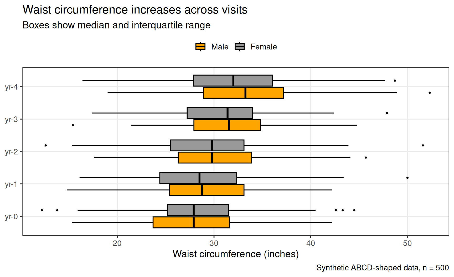
anthro |>ggplot(aes(x = visit, y = waist, fill = sex)) +geom_boxplot(col ="black", outlier.size =0.8) +coord_flip() +scale_fill_manual(values =c(Male ="orange", Female ="grey60")) +labs(x =NULL,y ="Waist circumference (inches)",fill =NULL,title ="Waist circumference increases across visits",subtitle ="Boxes show median and interquartile range",caption ="Synthetic ABCD-shaped data, n = 500" ) +theme_bw(14) +theme(legend.position ="top",panel.grid.minor =element_blank() )
Figure 6: A finished figure
x = NULL removes an axis title entirely, which is often cleaner than an empty string. fill = NULL does the same for the legend title.
Saving a figure
ggsave() writes the most recent plot to disk. The file extension picks the format:
Two things make the difference between a figure that looks right on screen and one that looks right on the page:
Set width and height explicitly, in inches, at the size the figure will actually be printed. The text sizes from theme_bw(base_size) are in points, so a plot saved at poster size and shrunk into a paper column ends up with unreadable text.
Use dpi = 300 for raster formats (PNG, TIFF) — the usual minimum for print. Vector formats (PDF, SVG) stay sharp at any size and ignore dpi.
To save a specific plot rather than the last one, store it and pass it in: p <- ggplot(...) + ..., then ggsave("output/p.png", plot = p, ...).